2016
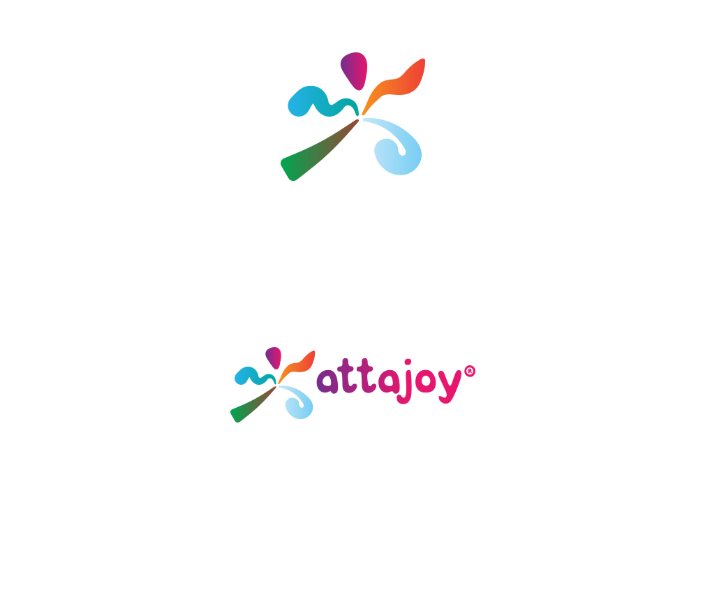
Attajoy is inspired by the popular phrase "Attaboy, " an enthusiastic response to a job well done or an impressive stunt. The name captures the excitement surrounding sports activity, the joy of recreation, and the athlete's sense of accomplishment.

What does it mean to enjoy the outdoors? The sound of crackling fire? Refreshing water during the summer? The feel of grass and ground under your feet? The fresh air of the joyful mornings? You get the picture... It is the four elements of nature: fire, water, earth and air. Once we circle everything together, we get something that can become the 5th element - Joy! Or should we say Attajoy!
We wanted to coin Attajoy not only as a new catchphrase
for enjoyment and outdoor recreation, but as a vivid
image for the brand's products: from camping supplies
to BBQ tools and everything in between.
Our goal: a logo that instantly relates the joyfulness
of the outdoors with meaning and visual strength. Our
solution: see for yourself.

The great outdoors; the tingle of grass underfoot; the rumble of gravel as it meets the grit of a running shoe. What we stand on, and how we stand on it, makes us stand out.

Clean oxygen announces bright mornings and cool evenings. Whether we’re enjoying some downtime or living it up in nature’s company, fresh air always gets us pumped.

The splash zone is our favorite territory—perfect for kicking up a storm. And when the mist settles, we happily take to the shore for some lazy lounging and smooth sailing.

As family we gather around the bonfire to get all warm and fuzzy. But when the games get going, our friendly fire drives us to bring our best and smoke the competition.


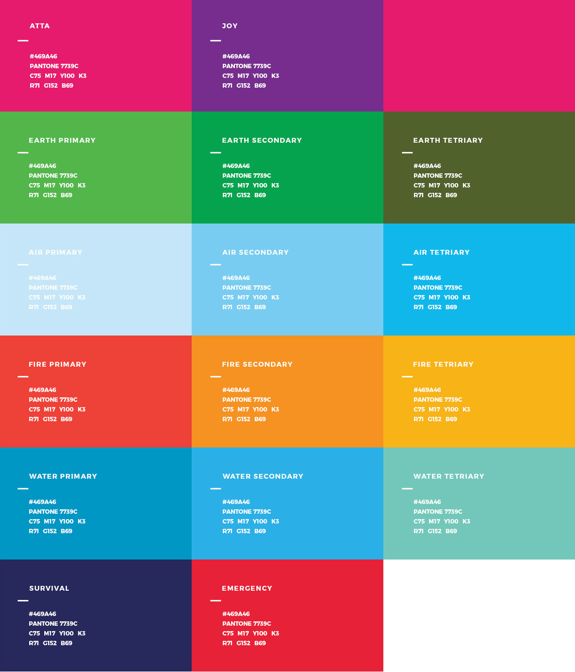
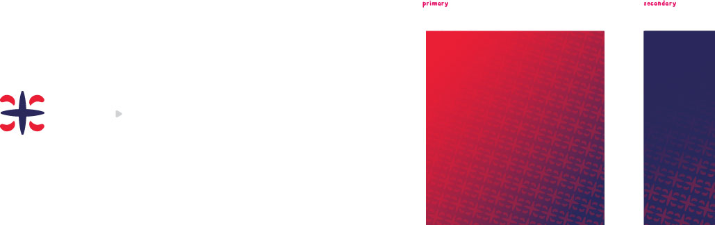
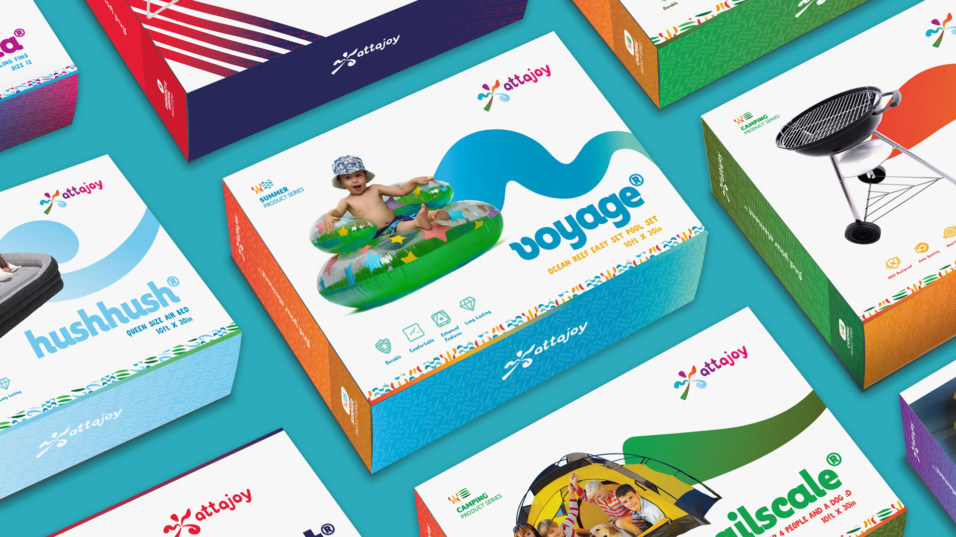
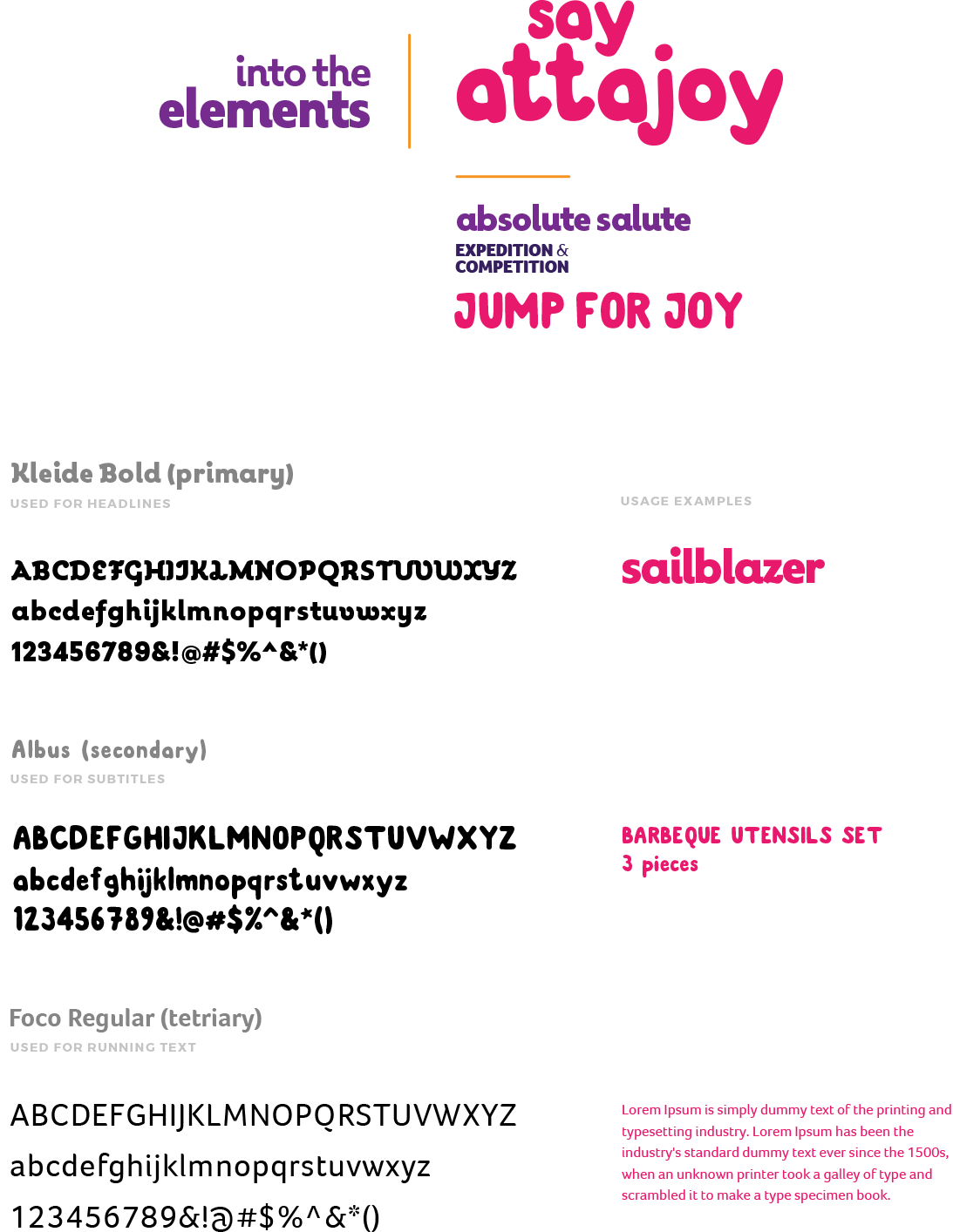
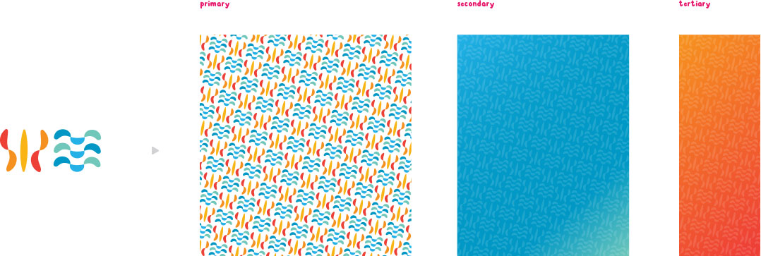
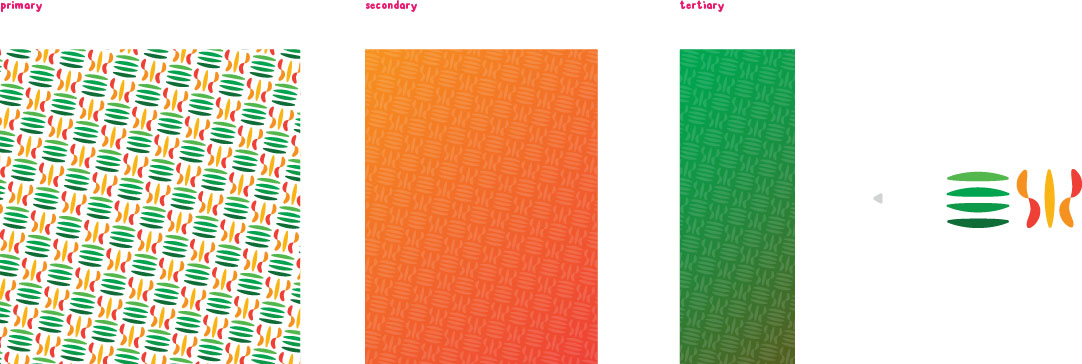
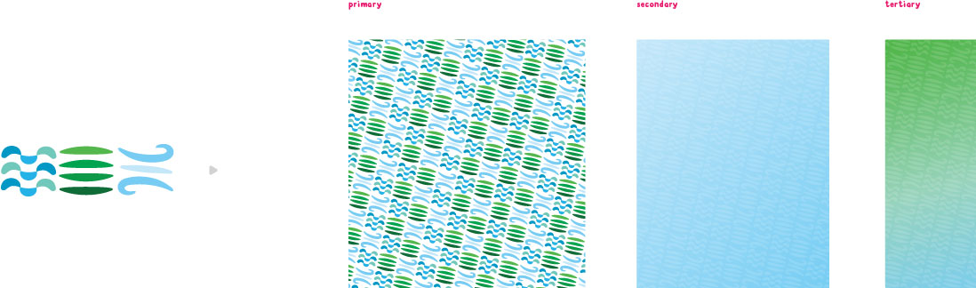
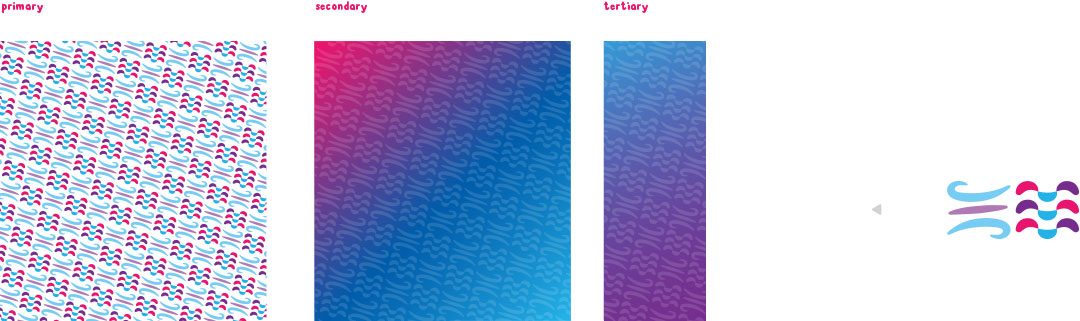
The Attajoy’s brand colors are intended to be related to the product categories. We created a set of unique gradients which work systematically with its own product series.
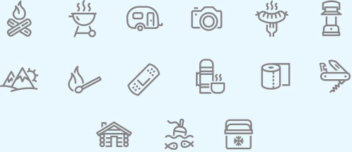
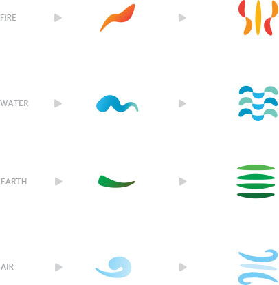
The product icon designs are created to categorize
Attajoy's multiple product series, combining element
icons to visually identity each product, series, and
seasonal lines. Each product series has its own unique
combination of elements for series recognition, and
the colors that align with the product category.
To develop a product categorization series, we used
the existing brand elements, the 4 elements of nature.
We worked with each element to create visually-recognizable
icons that aligned with the product line and communicate
the brand essence to the target demographic.
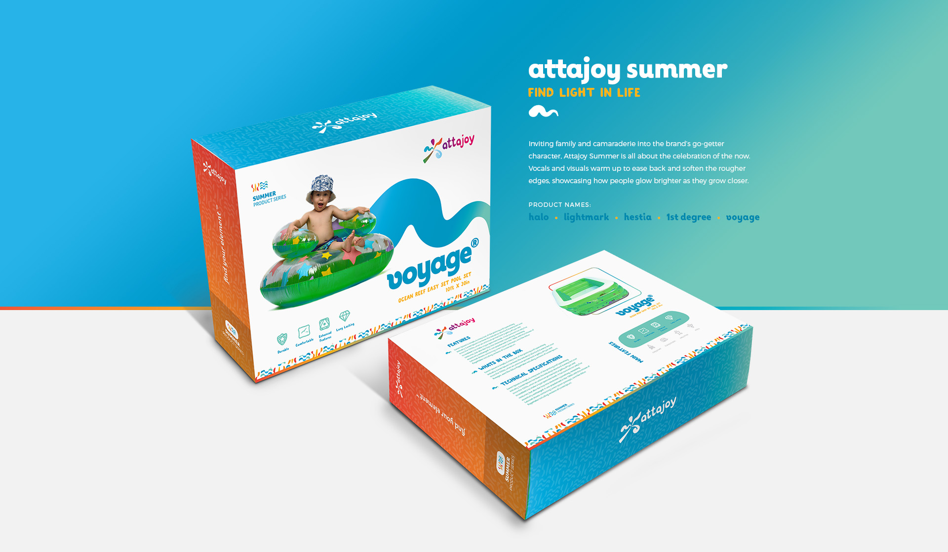
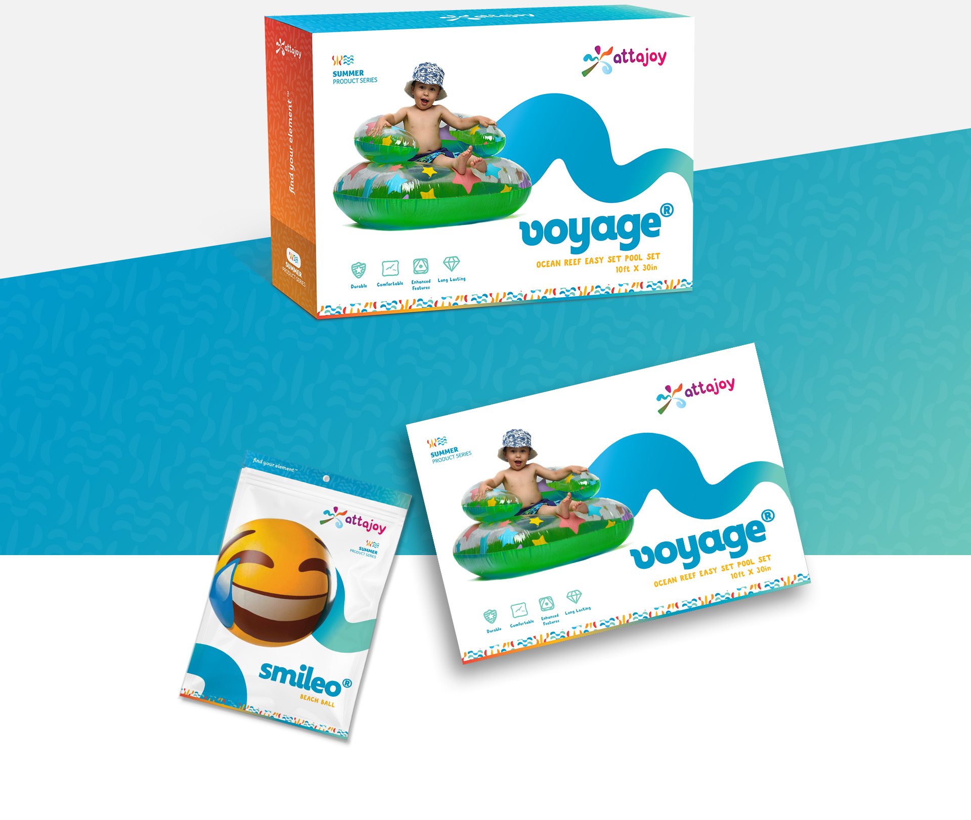
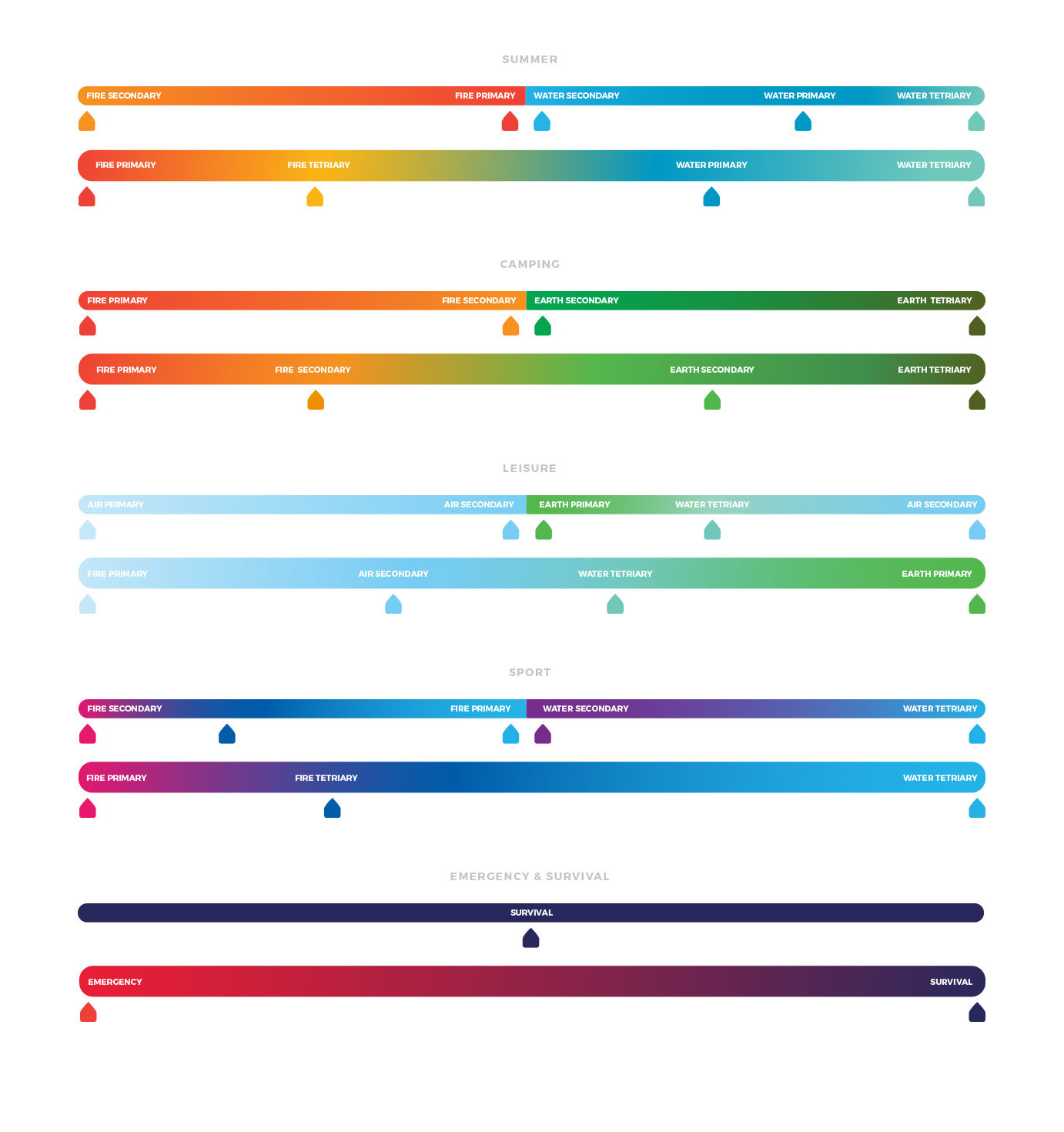
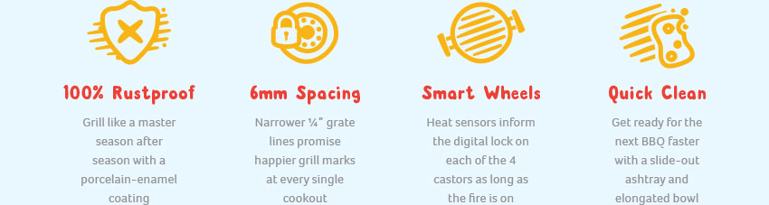
The Fire and Water together bring to mind the hot summer sun with the splash of a cool lakeside jump. What better way to relax than to cool off, refresh, and enjoy the sunshine?
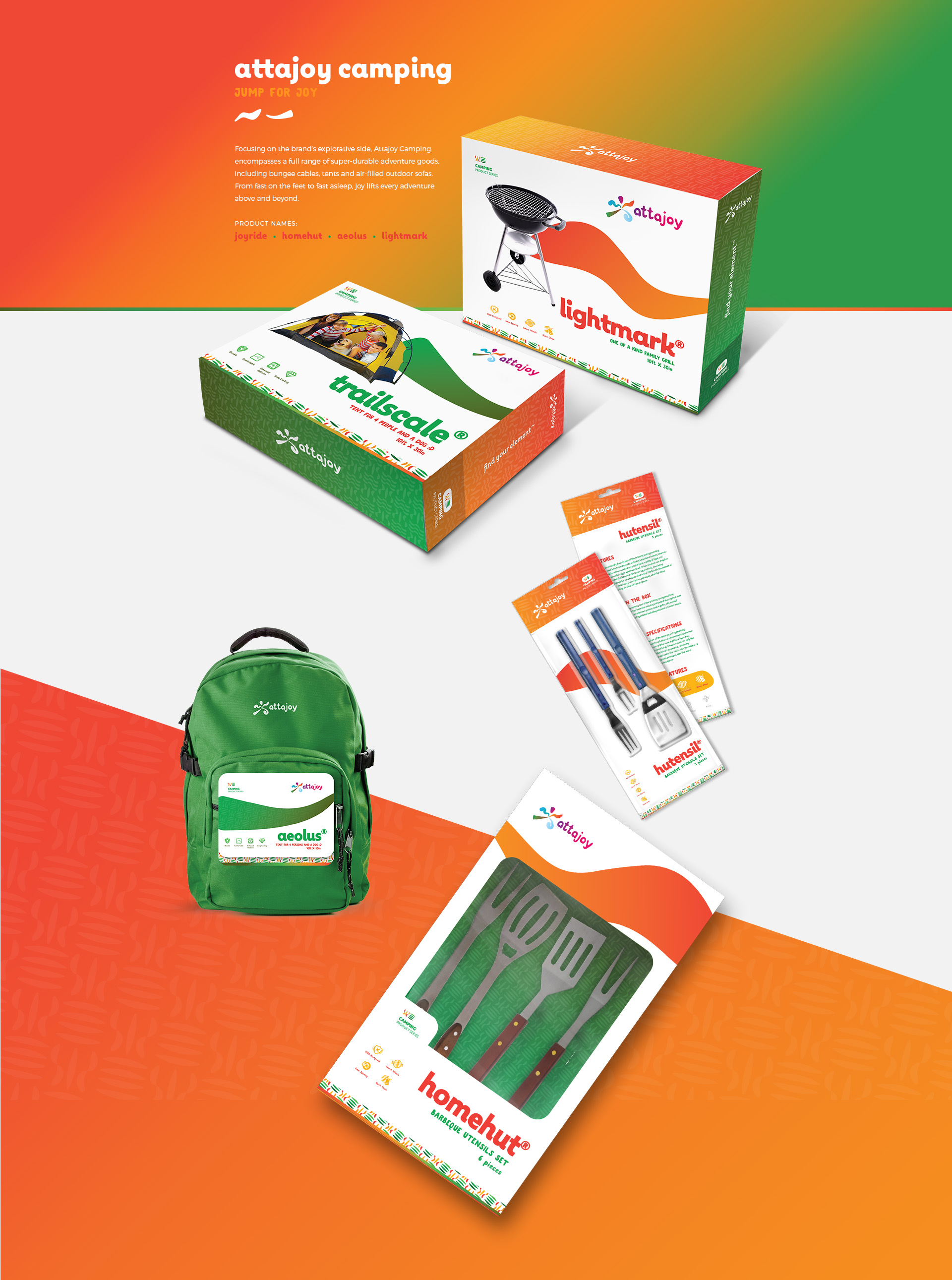
For the Camping product series, we used the Earth and Fire icons. What can recall the memory of the outdoors like the fresh smell of earth, the feel greenery underfoot and the smoky flames of a late-night campfire?
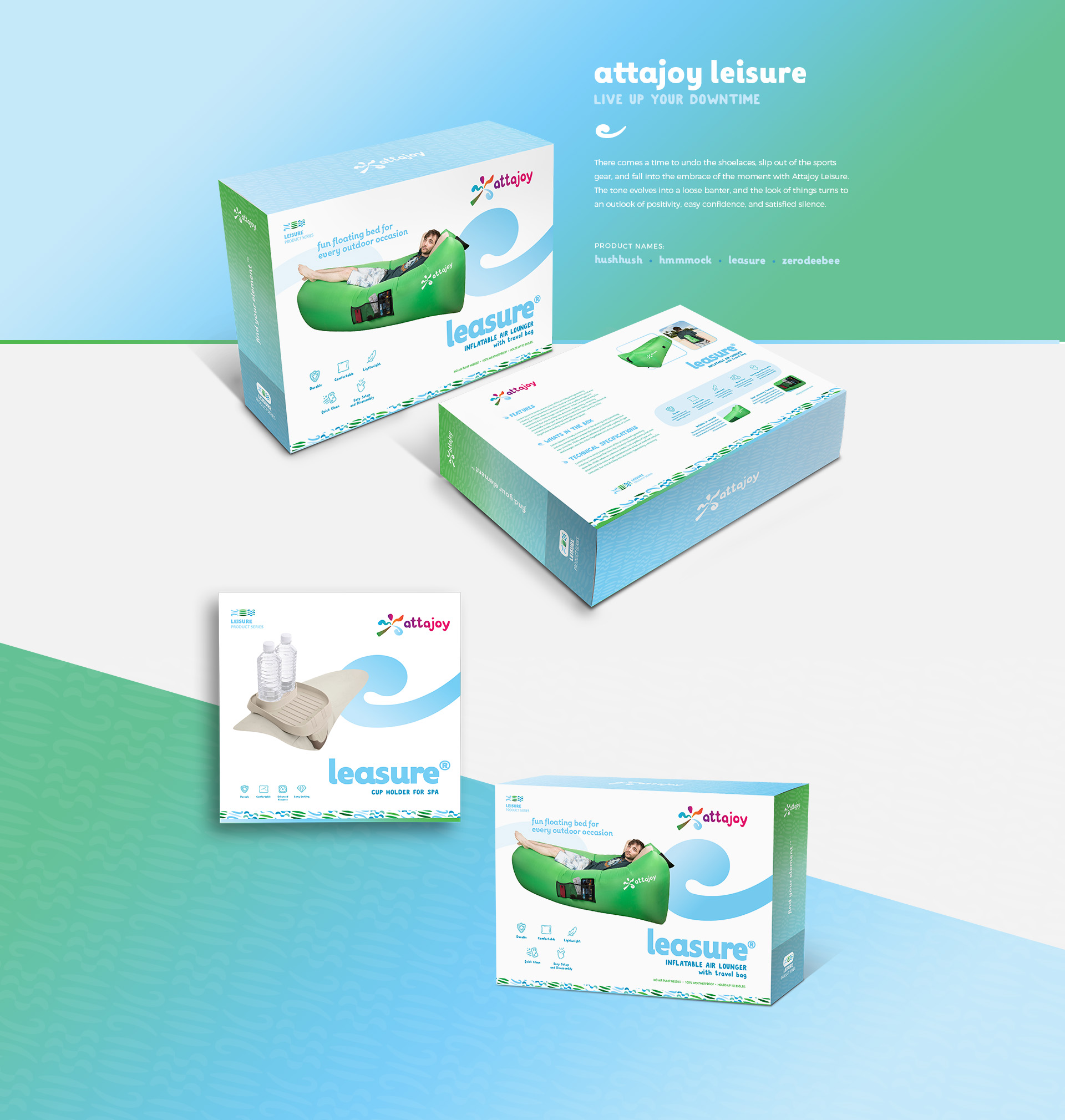
The Lesiure product series is identifed by the Water, Earth, and Air icon. Experience the serenity of a poolside summer evening, the cool breeze off the country lake, and the sweetness of family memories made outside.
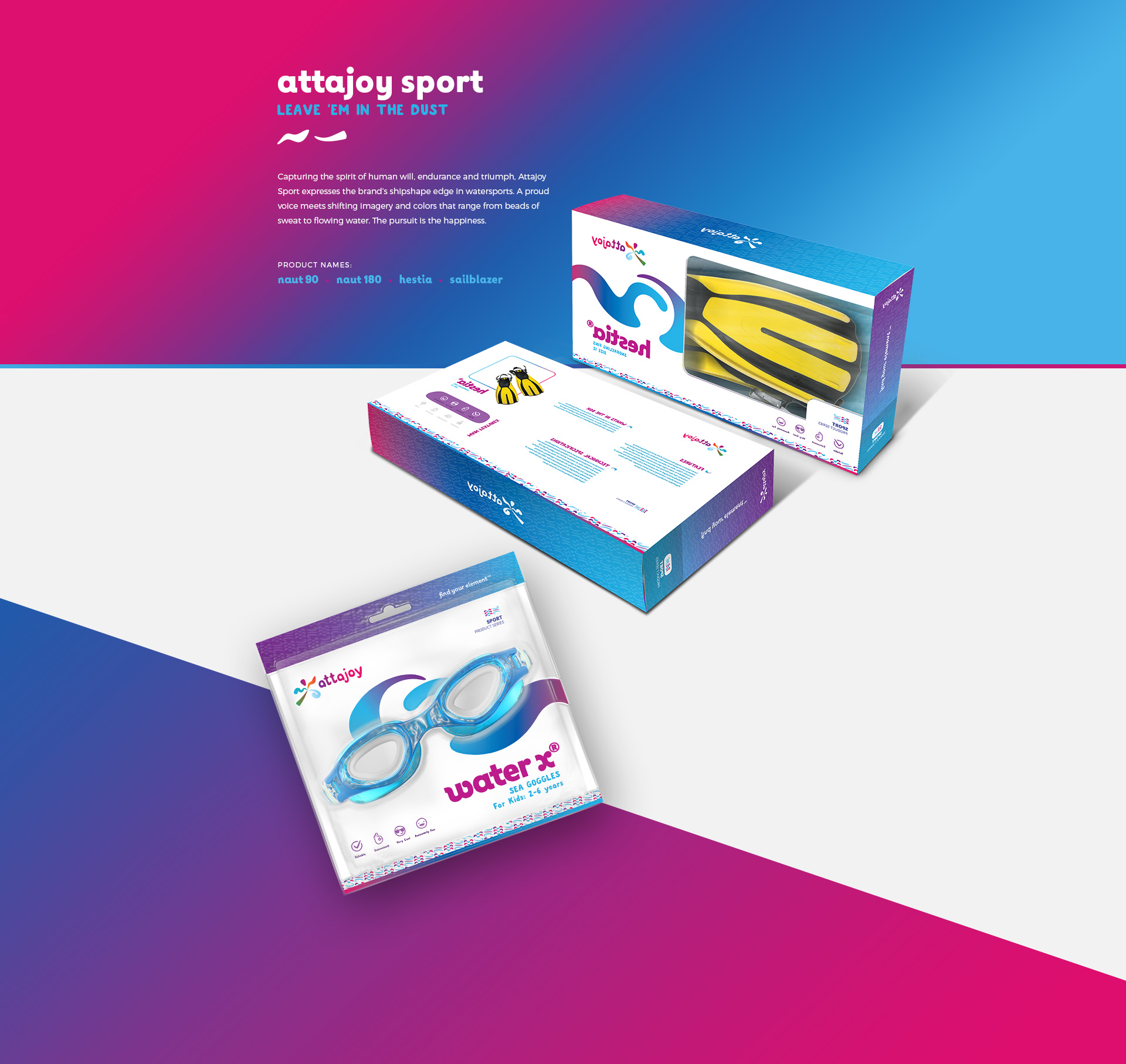
Designed in the bold colors of our Sports palette, the Sport product series is identified by Air and Water. Feel the surge of adrenaline when speed and wind combine, and ride the thrill of the waves warmed by summer sun for a truly joyful experience.
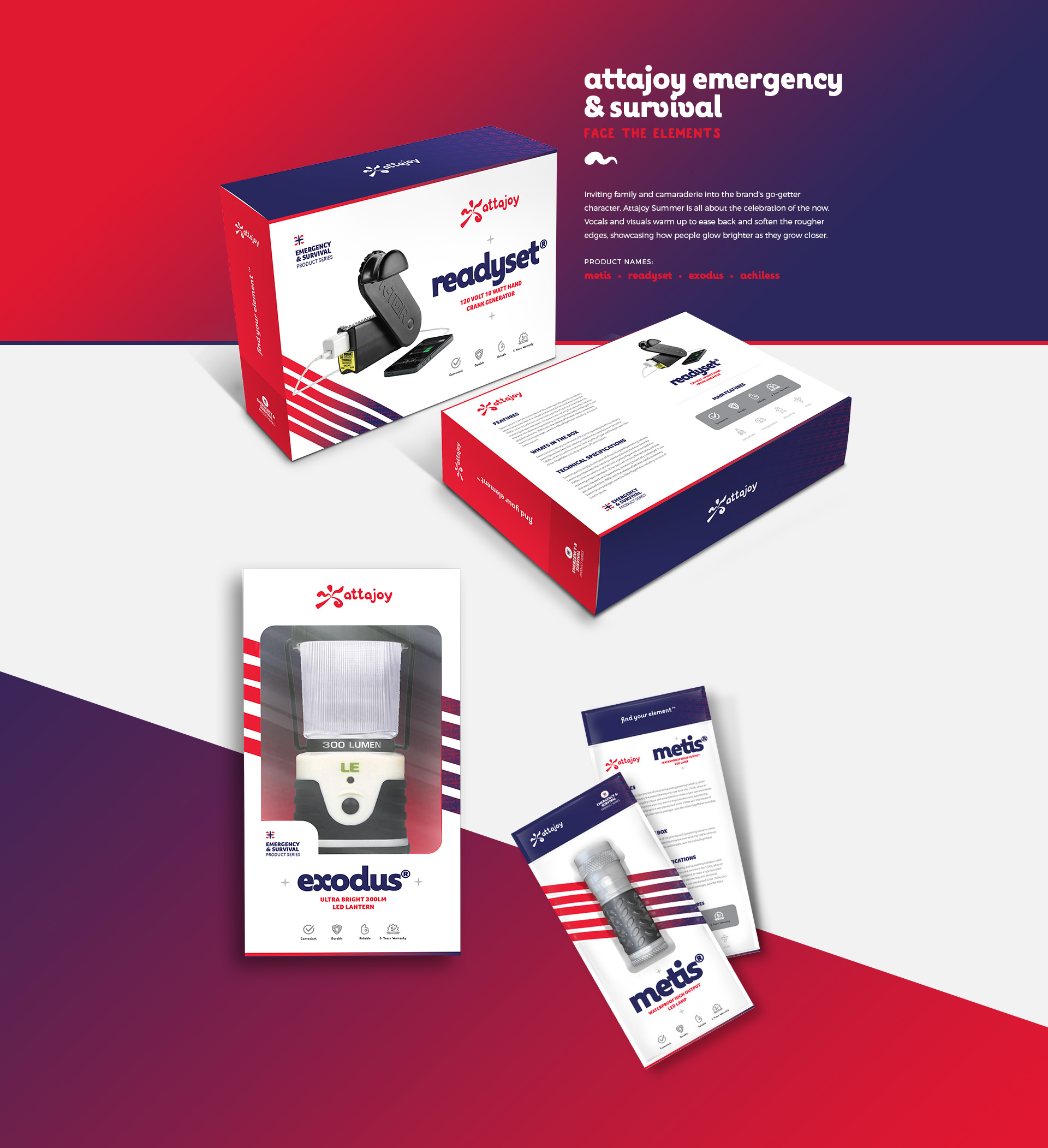
To identify the Emergency & Survival products, we took a new approach: creating a new icon out of the universal emergency symbol, elements of the brand design, and an urgent color palette to ensure universal recognition of critical products.