2016
Besides the leisure and spa elements, we have
focused on management and strategy part of the
brand. It is created to be a go-to brand “that
focuses on helping hospitality, residential and
wellness brands create exceptional innerfacility
experiences for residents/clients, we share their
journey from planning through design, launch and management”.
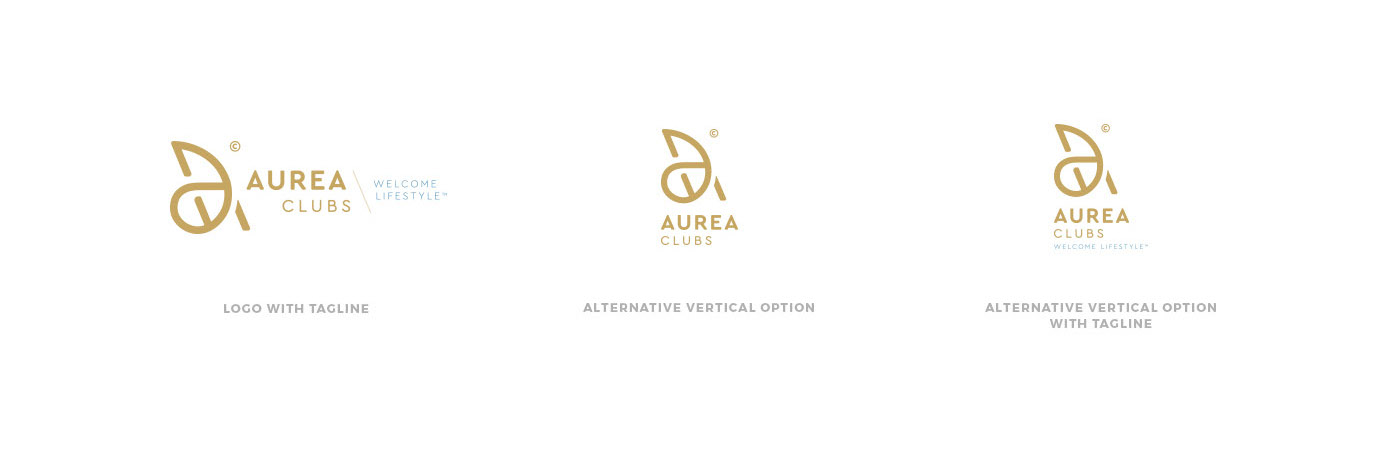
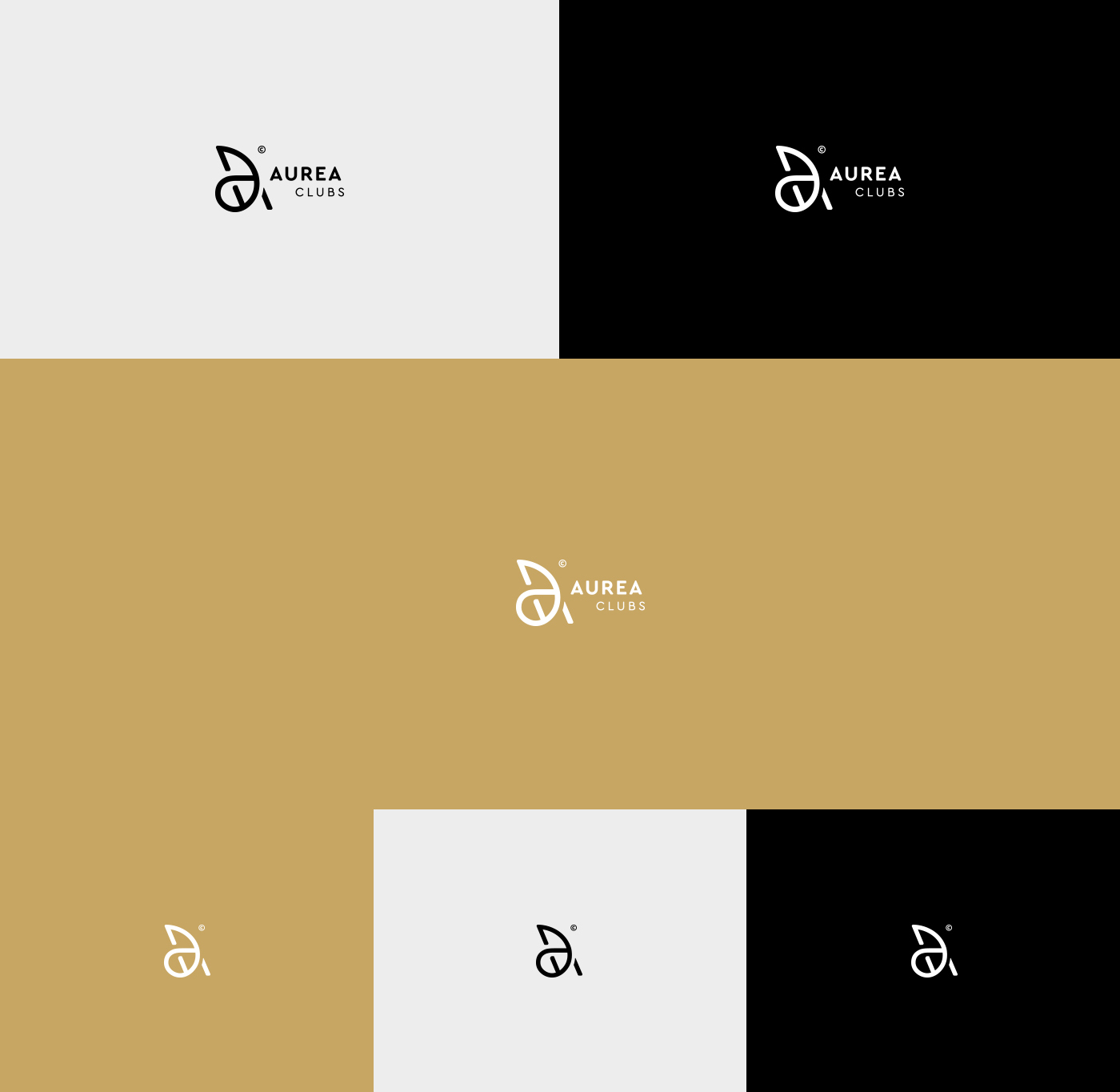
The Aurea Clubs logo has been created to be fixed
into the customers minds - to the ones that go to
seek help and exceptional service. This logo represents
a synonym of your business. It has warm, welcoming
and leisure feelings, but is yet professional and corporate.
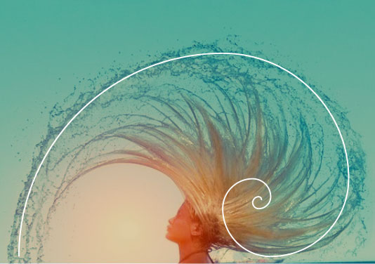
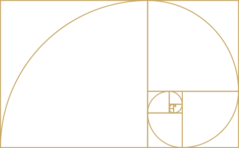
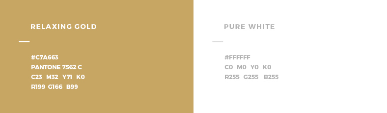
Our client said: “Aurea means golden, and is
affliated with the Golden Ratio, a proportion
concept used in design and architecture.”
Therefore we took the Fibonacci spiral as
main inpiration to develop the logo. Its
uniqueness and place in the nature and
universe got us very inspired and we
wanted to create something that will
inspire others.
We asked ourselves, what is Aurea Clubs?
It’s nature, strategy and overall wellbeing
of business and health.
Working with the themes of nature and the Golden Ratio, we developed a range of wellness-inspired shapes to develop a logo full of meaning and designed to stand out.
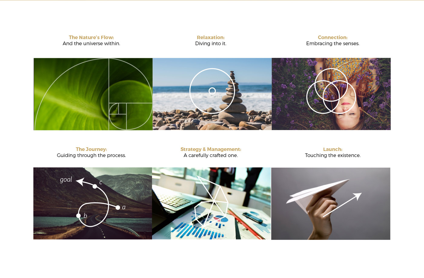
To create an inimitable logo, we integrated the
themes of nature, strategy, proportion, and leisure
into one unforgettable, timeless, and sophisticated logo.
Oh, and we forgot to mention. We added the letter A.