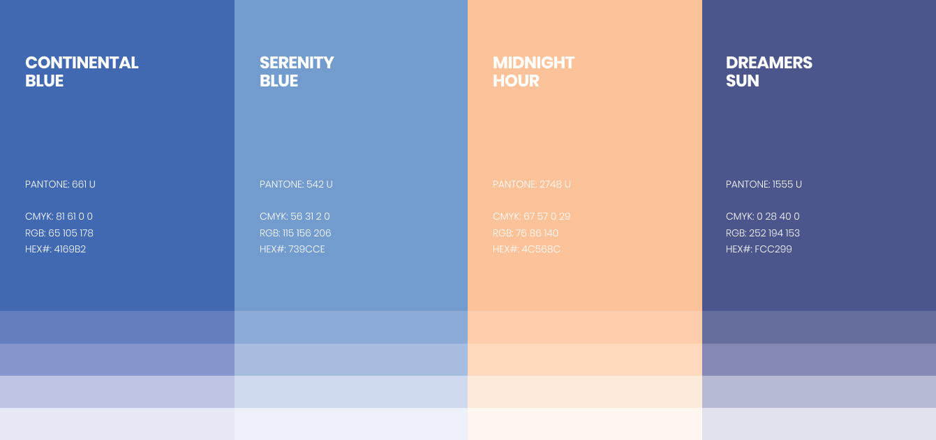
2019
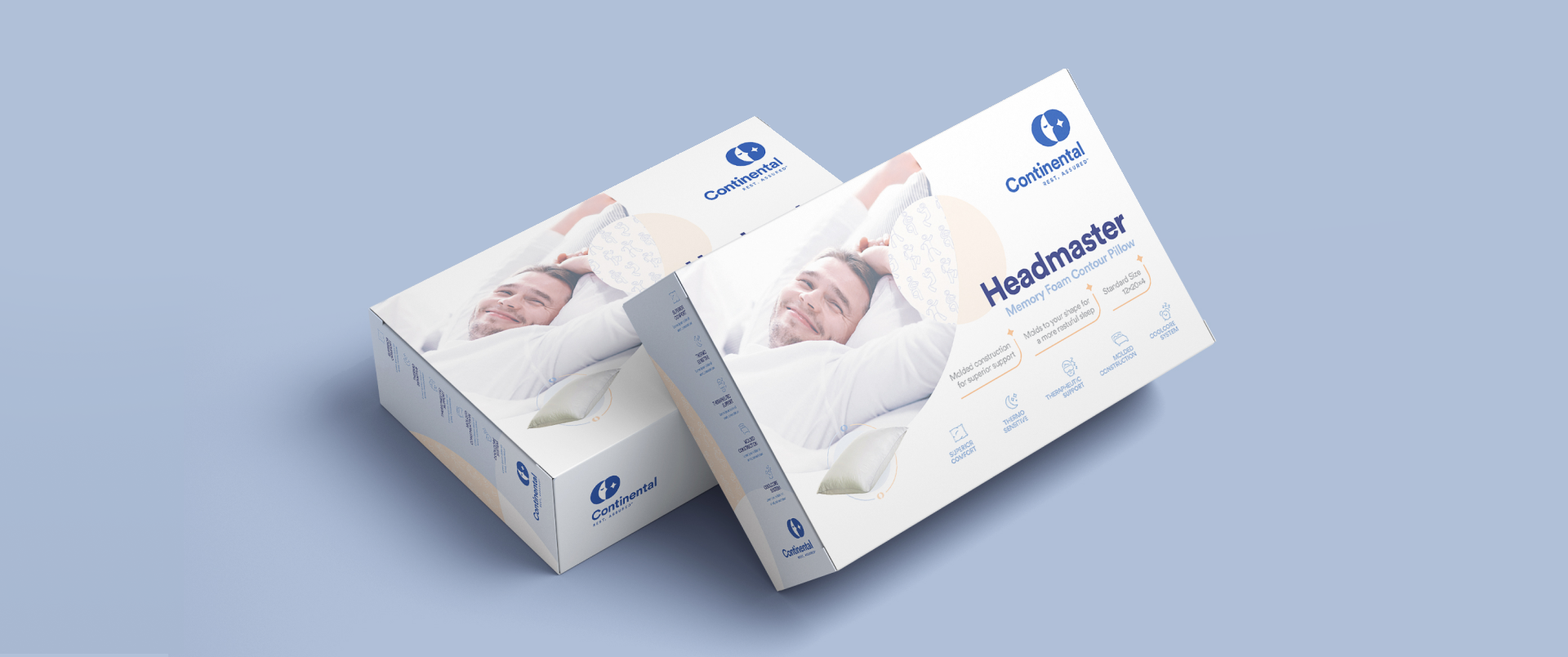
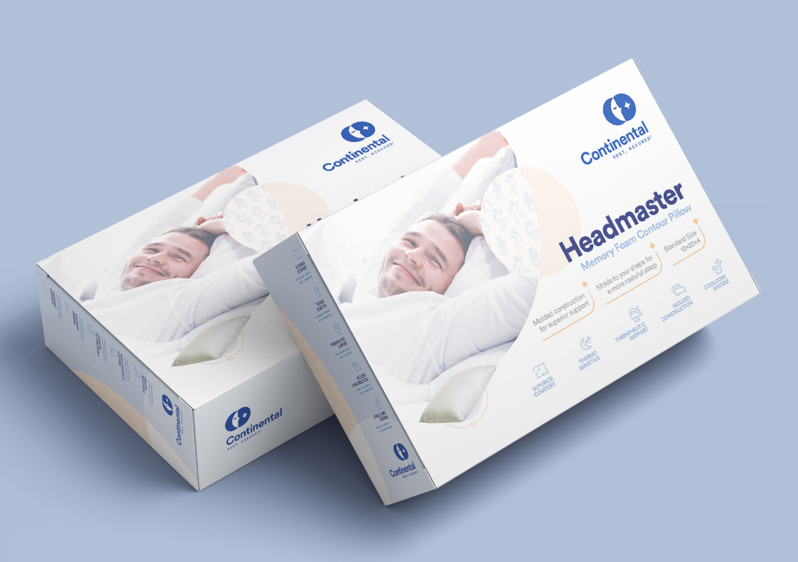
Continental Bedding designs and
manufacturers high-end bedding, including
pillows. These pillows are designed for
different levels of support, shape, and sizes.
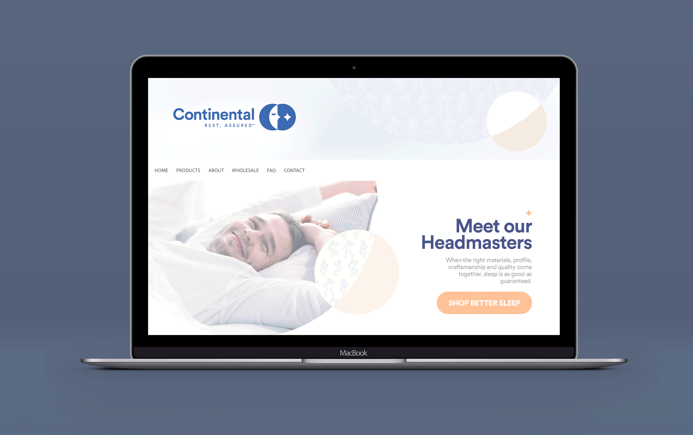
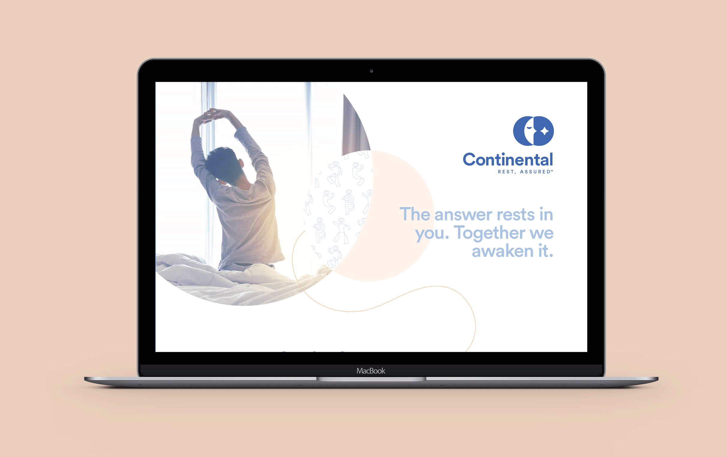
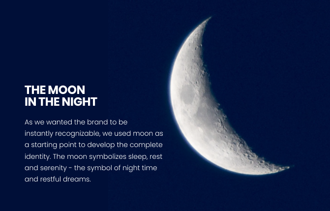
We envisioned Continental as a modern
brand that balances the feelings of serenity
and a good night's sleep with a fast and
modern life that requires full focus to make
every day count. It conveys ultimate sleep
quality, which is essential for making every
day productive.
We made Continental shine because of its
innovative approach to the brand identity
within its market, which other brands
claiming differentiation have made common.

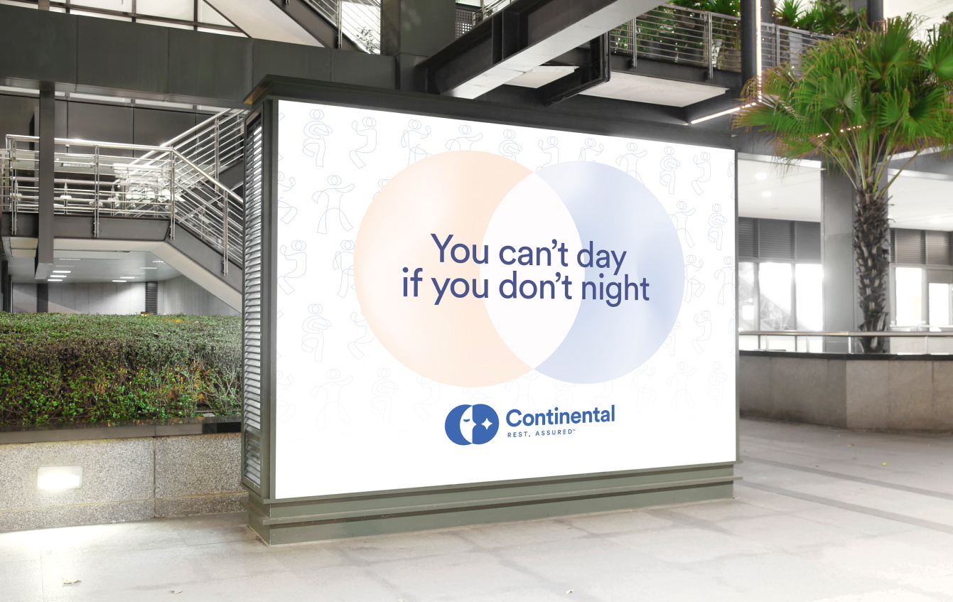
The things that balance both sides (day and night) are the stars on the night sky, preparing us for rest, as well as what comes after. They act subtly to ensure we have the best of both worlds. The stars represent time to rest, as well as dreams yet to become truth.
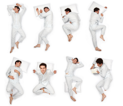
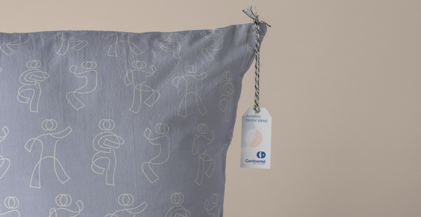
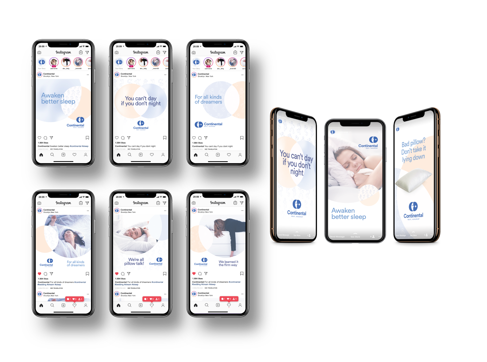
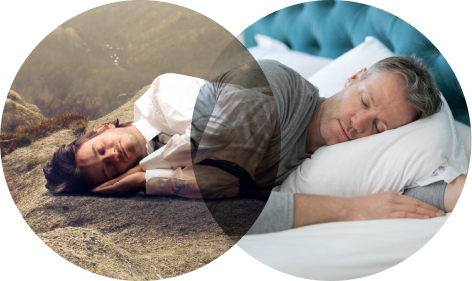
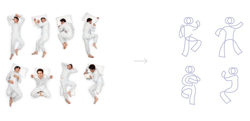
Continental believes that there is no single way to sleep, and how and where you sleep is personal. We honored that individuality and personal preferences by using the idea of people sleeping in different poses. A message that portrays that the choice rests within us and our customers, and Continental is there to awaken it.

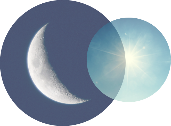
Both the moon and the sun are circular shapes, indicating harmony, fullness and peace of mind.
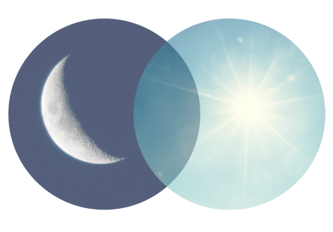
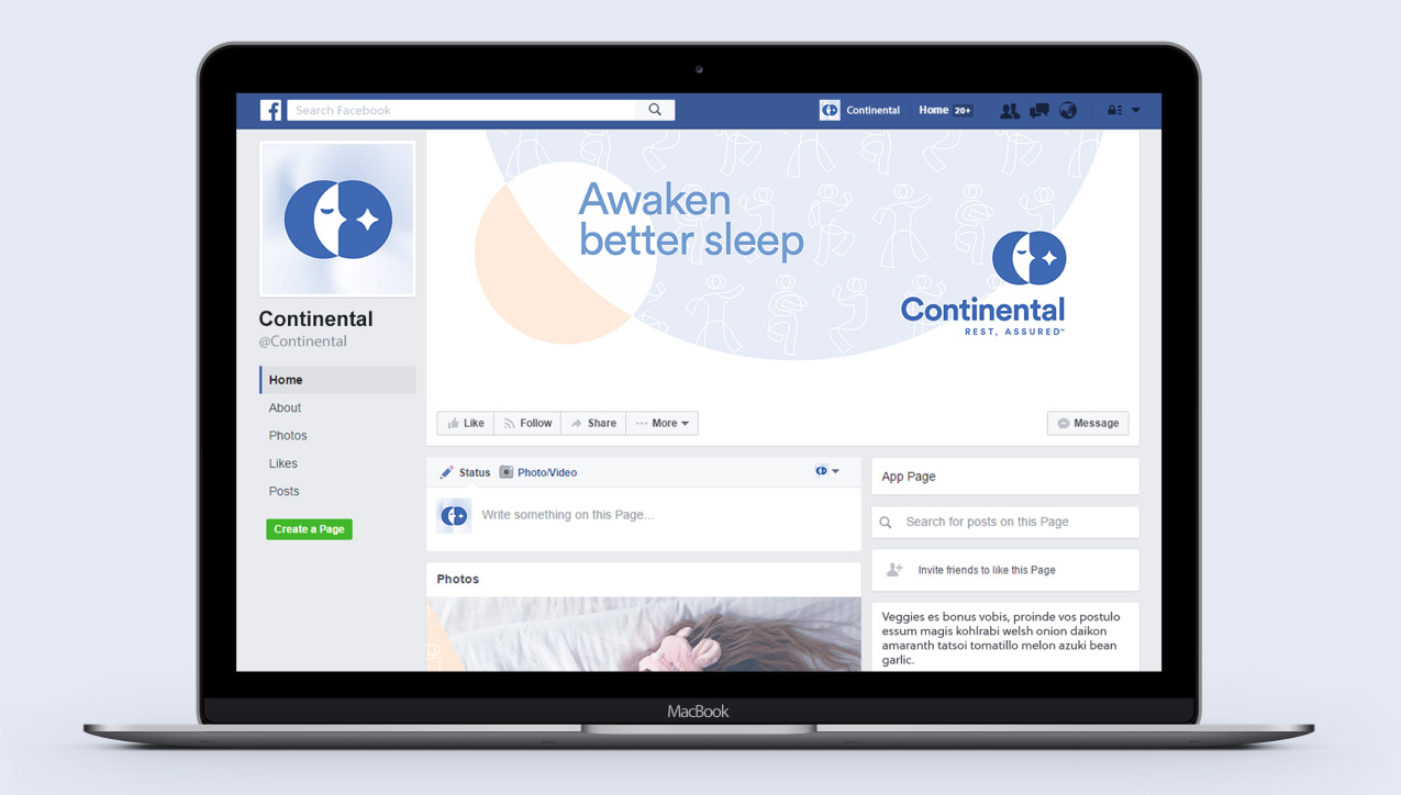
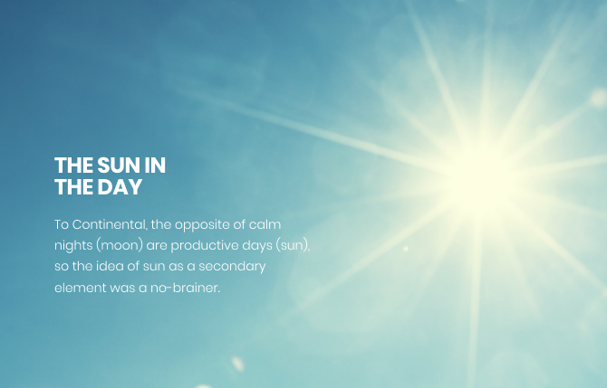
Our main goal for the overall brand identity was to portray the idea of the overlap between day (sun) and night (moon), and portray how their seamless coexistence in the identity symbolizes the harmonic dance between restful nights and productive days. This plays a crucial role throughout the branding: create the message that one can’t exist without the other.
Just as the overlap between night and day exists in our
branding, so does the overlap between dreamers and sleepers.
We see Continental speaking to sleepers who dream big, as well
as sleepers who have achieved their dreams and just enjoy the
blessing of closed eyes.
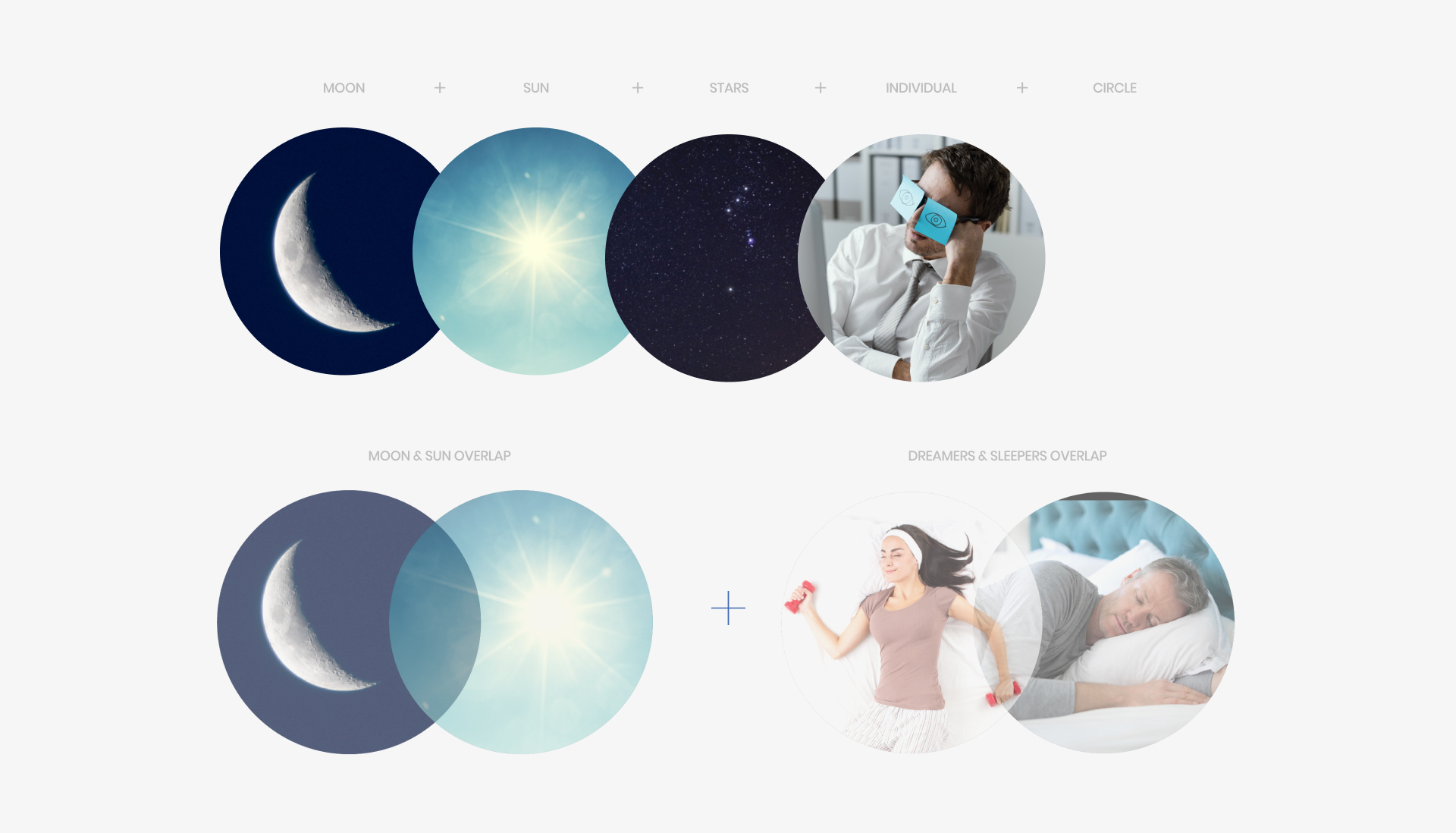


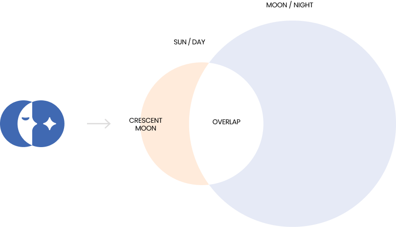
The two circles overlap, representing
the moon and sun and the two
phases of the day. This way we
created two crescent moons, the
most recognizable moon phase. The
sun (on the right) is a carrier of other
elements.
As we already mentioned, this was
the main idea that carries the brand
identity. The sun will be more
important in other brand identity
elements.

The two circles overlap to create a
crescent moon and indicate the
core business of Continental - good
sleep.
Because “We are committed to help
you dial in the right kind of product
that helps you rest as you please.”

Going forward is represented by a
trace of a shooting star, indicating
the aspiration for better living.
Because “You are discovering the
sleep you’ve been dreaming about.”

nside the circles we have a face
with closed eyes, representing
individuals and personalities that
are sleeping in their own way, with a
star guiding them to dream.
Because “We understand that only
you know how you sleep best.”

For further extending the brand identity, we leaned on the main
idea - the combination of sun and moon, or night and day, if
you will. This idea perfectly combines what we want to achieve -
productive days made by restful nights - and it is an extension
of the logo design.
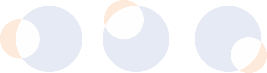
The combination of the two created a graphic element
similar to the logo, but here we gave more importance
to the sun. It is overlapping the moon, and while it
does that, the sun is made into a crescent moon shape,
which follows the whole identity.
This is a straightforward indication of “night
influencing day” because even the sun is given
the shape of a moon phase.
It goes in multiple directions (just like the
sun and moon seen from Earth) for different
branding applications.
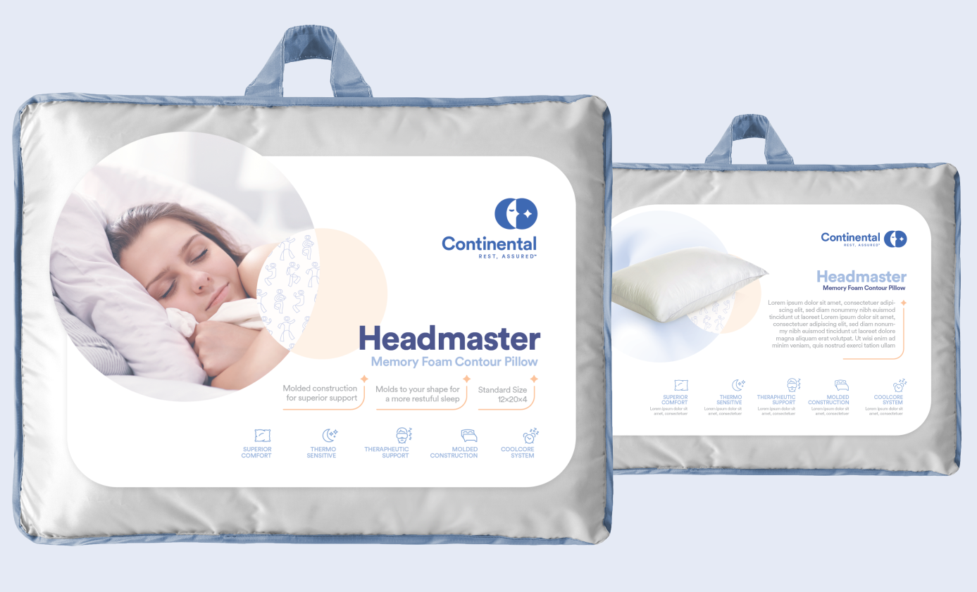
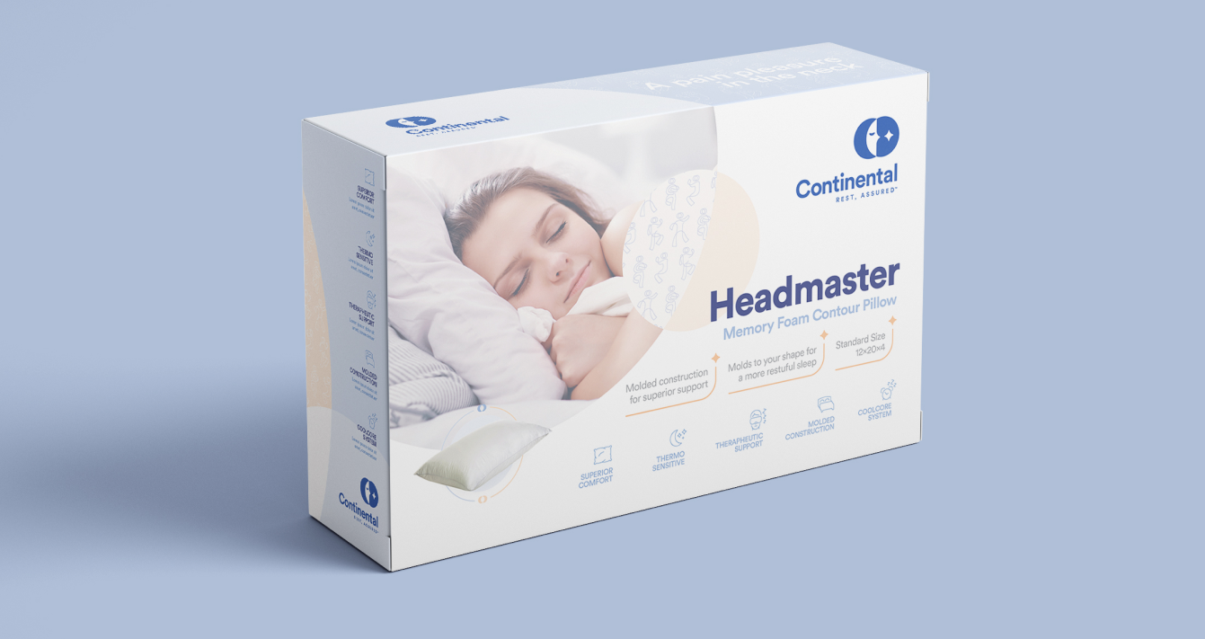
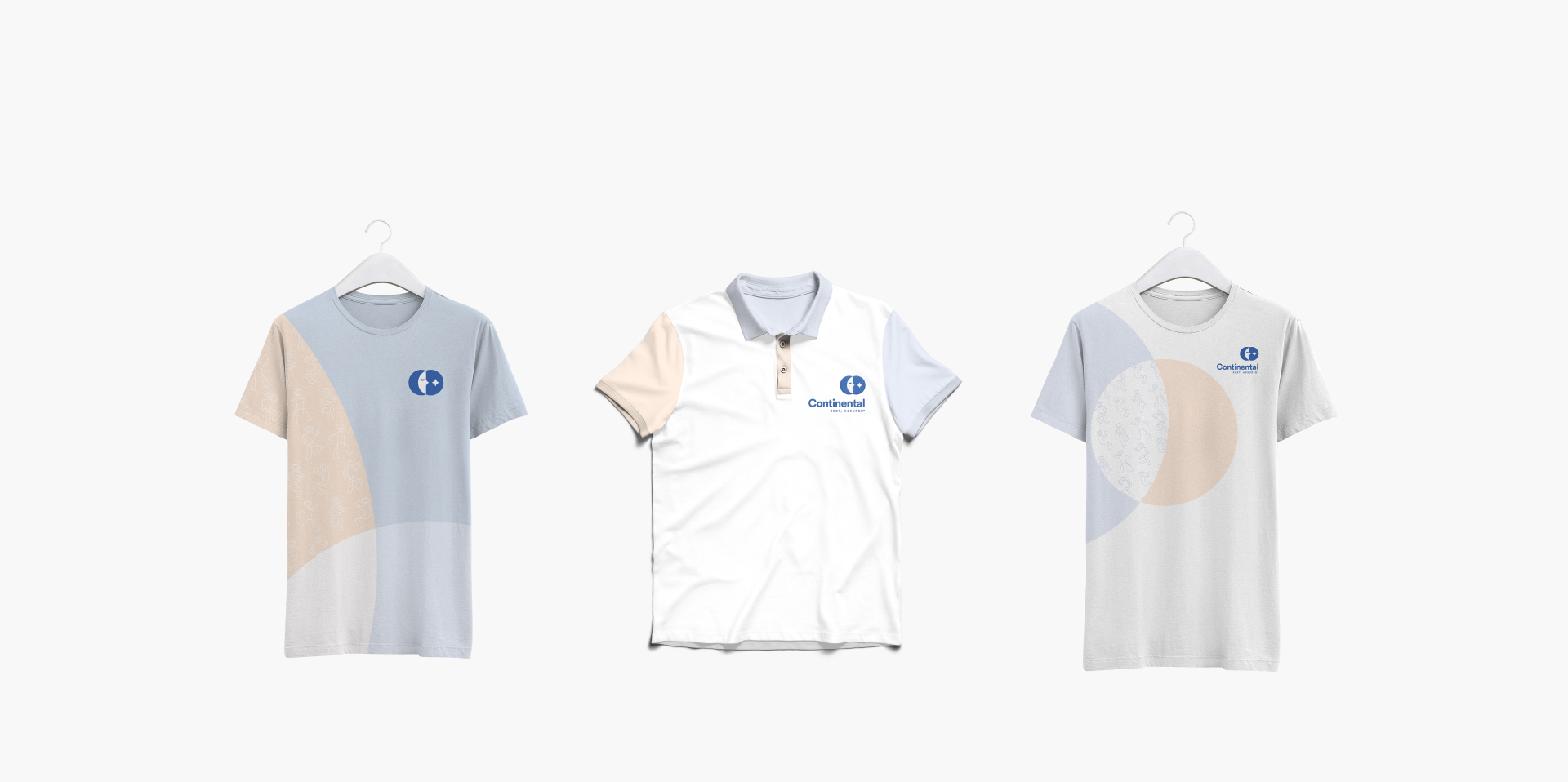
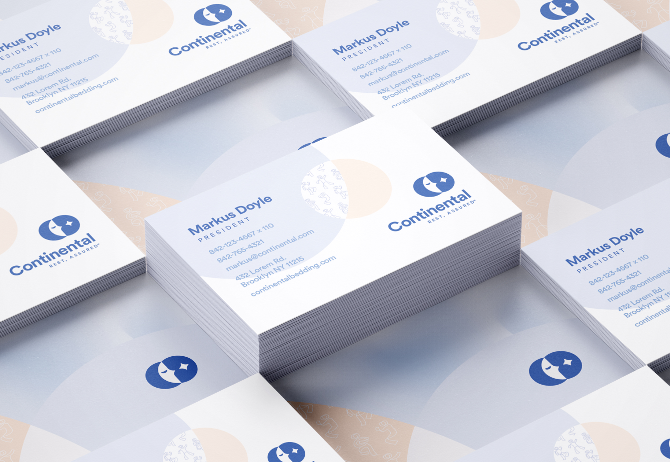
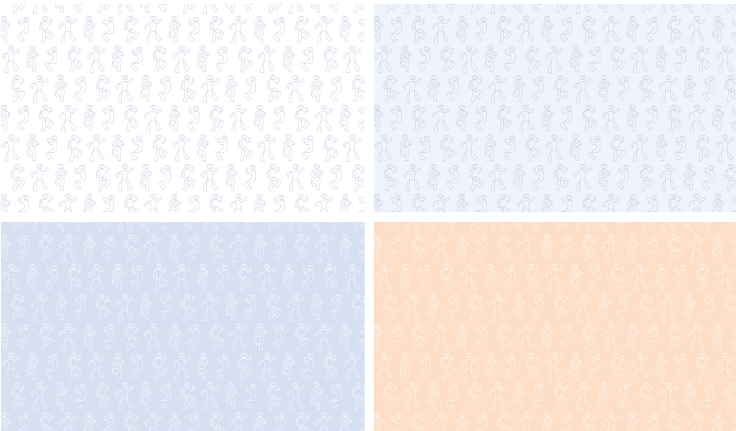
For the pattern visuals, we opted for the individuality idea as one of the more important aspects of branding. Therefore, we used the actual poses of sleeping people to create a pattern that gloriously follows the focus elements.
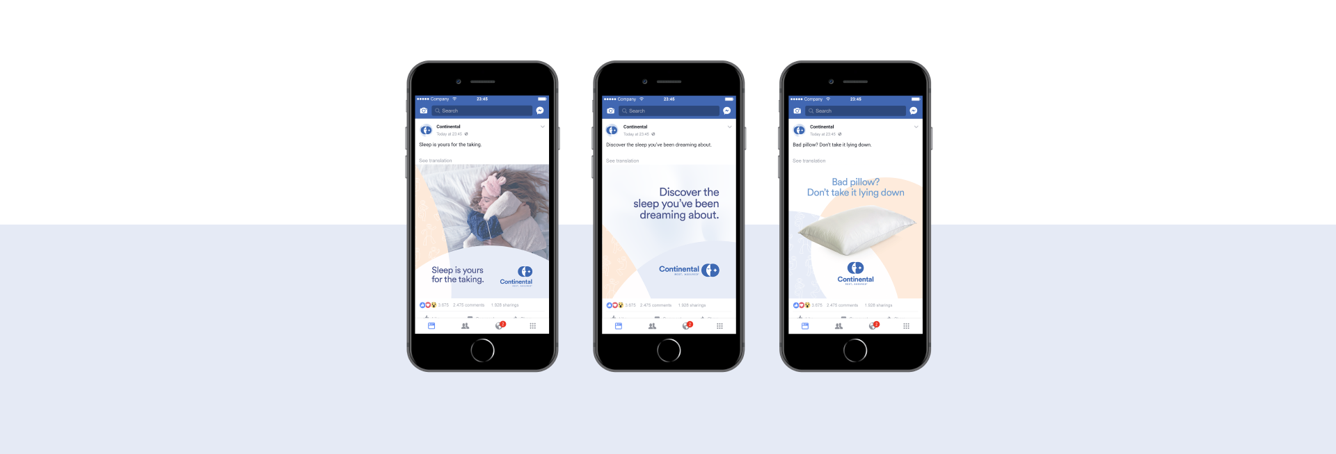
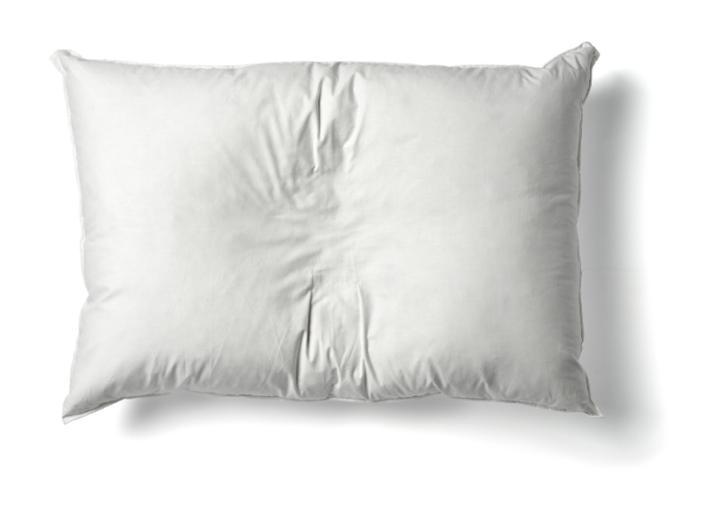
The background image is a supporting secondary visual that contributes to the cozy feeling of a down pillow, and indicates softness, relaxation and a dreamy atmosphere. We were inspired by the impression made on the pillow when we slept on it.

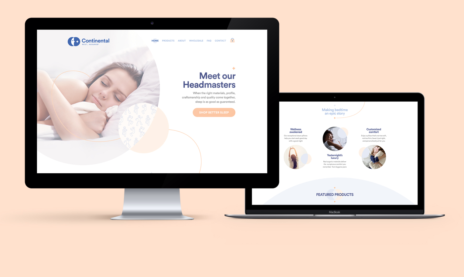
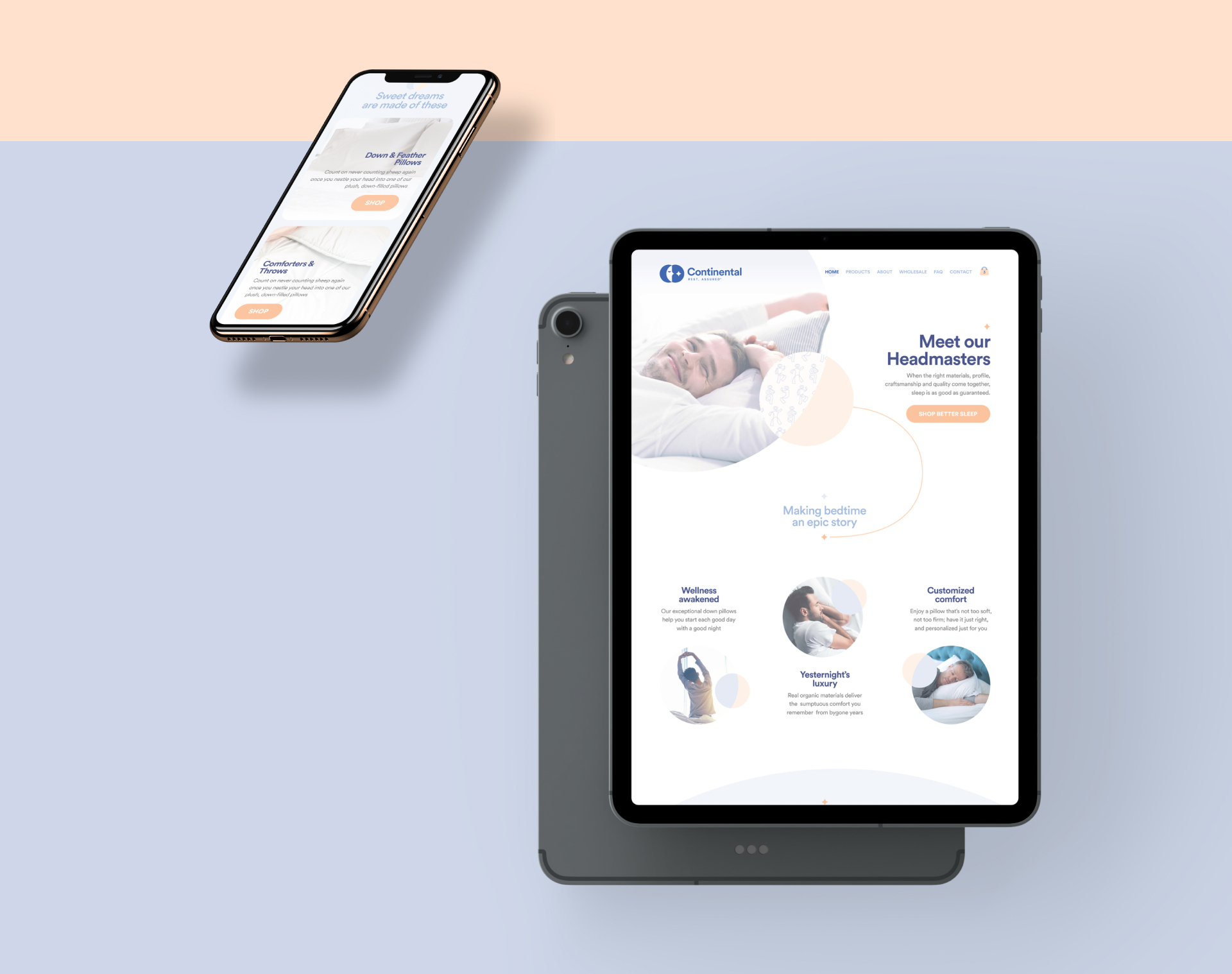
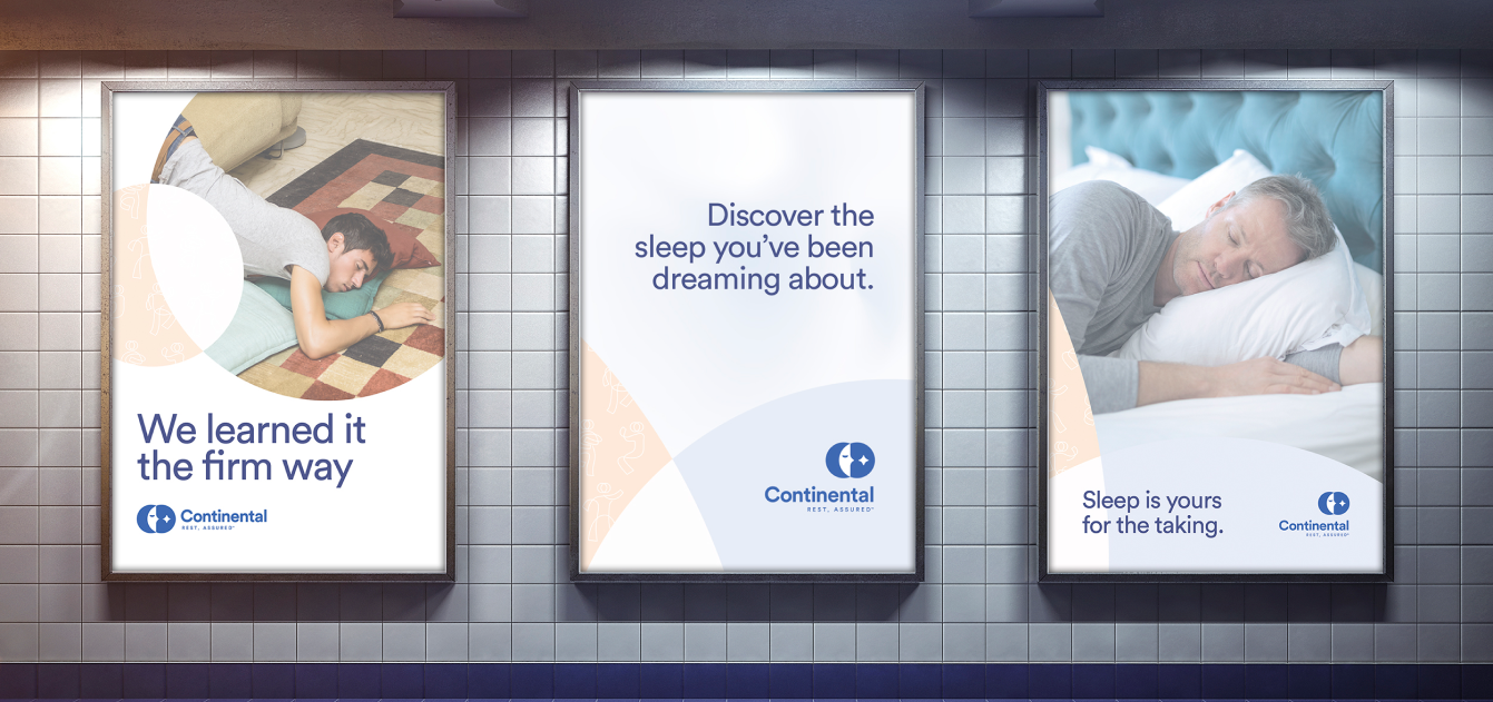
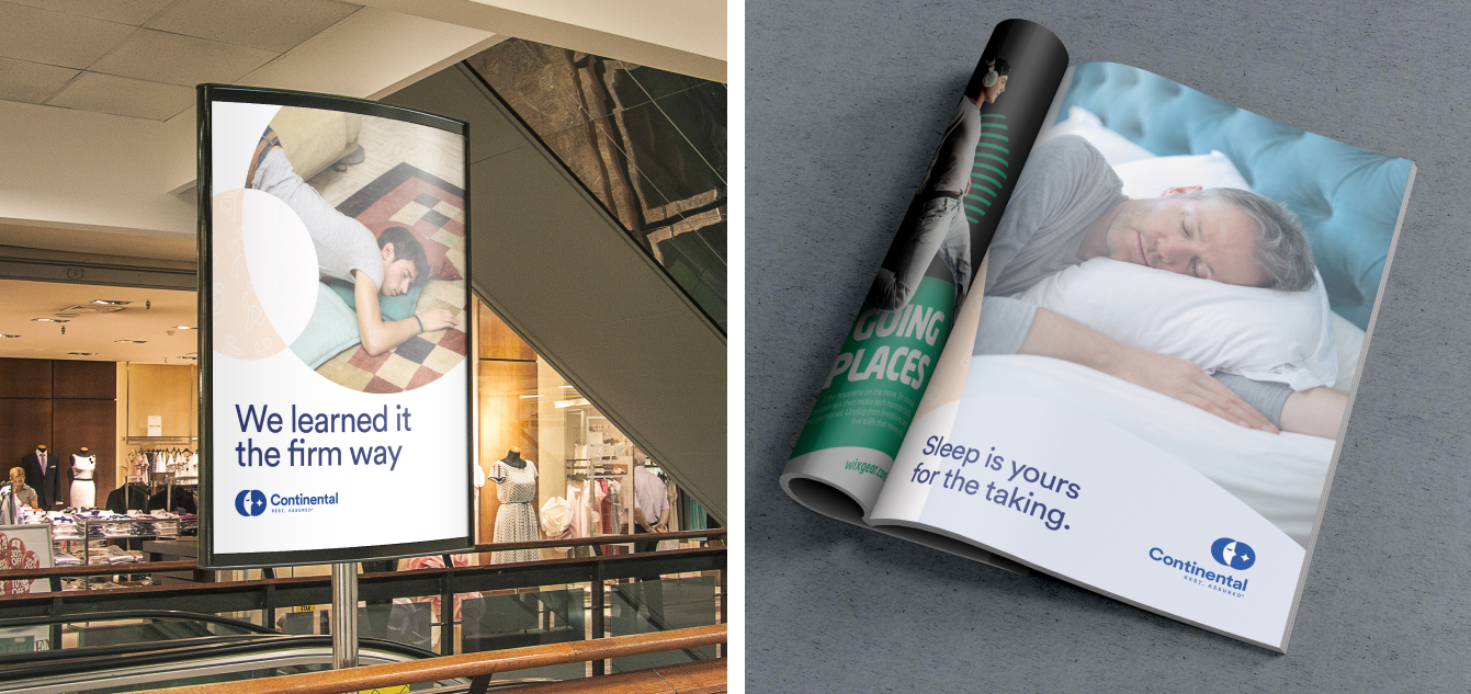
The Continental’s photography tone is expressed
with simple confidence and elegant imagery that
is infused with a gratifying and satisfactory
sleep or awaken state, that is saying either
“let me sleep just a bit more” or “I’m ready
to take action.”
We processed the photos to have a touch of
serenity and a dream-like atmosphere.