
2018
DripDrop is a waterproofing company with years of experience, knowledgable professionals and innovative approach. For them, keeping the water out means keeping experience in. So much more than just applying a product, waterproofing is knowing how water runs, how protection works, how application matters, and how to respond when safeguards fail.
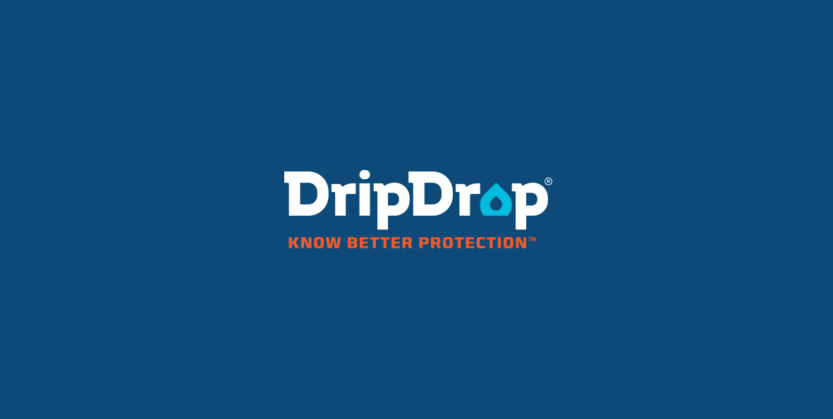
We envisioned DripDrop as an innovative, modern and reliable brand, with a clever twist. The logo is built in such a way that resembles the essence of the DripDrop business - keeping the water out. It is strong, unique and straight forward, giving the feeling of industrialism, knowledge and reliability.
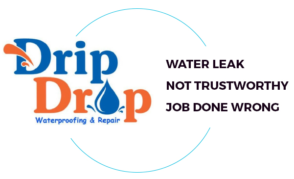
They came to us with a problem - the existing logo did not speak to what DripDrop is all about. For a waterproofing company, this logo shows a lot of water. It leaks everywhere, doesn’t look trustworthy and ultimately it leads to a job done wrong. Our mission was to spot the issues and redesign the brand feeling to values they want to promote.
Our concept of the logo (and entire brand image) leans on the idea of water stoppage, wrapped up in the knowledge and experience suit. To build the visuals, we used the essential standpoint of what DripDrop is all about and took it to the next step.


When we first saw the current logo, we didn’t think of professional, high-end waterproofing solutions. What we saw is the opposite - a water leaking, amateur and not a trustworthy solution for waterproofing. That being said, we were striving for a more radical redesign.
The solution - keep the water out, and experience in.
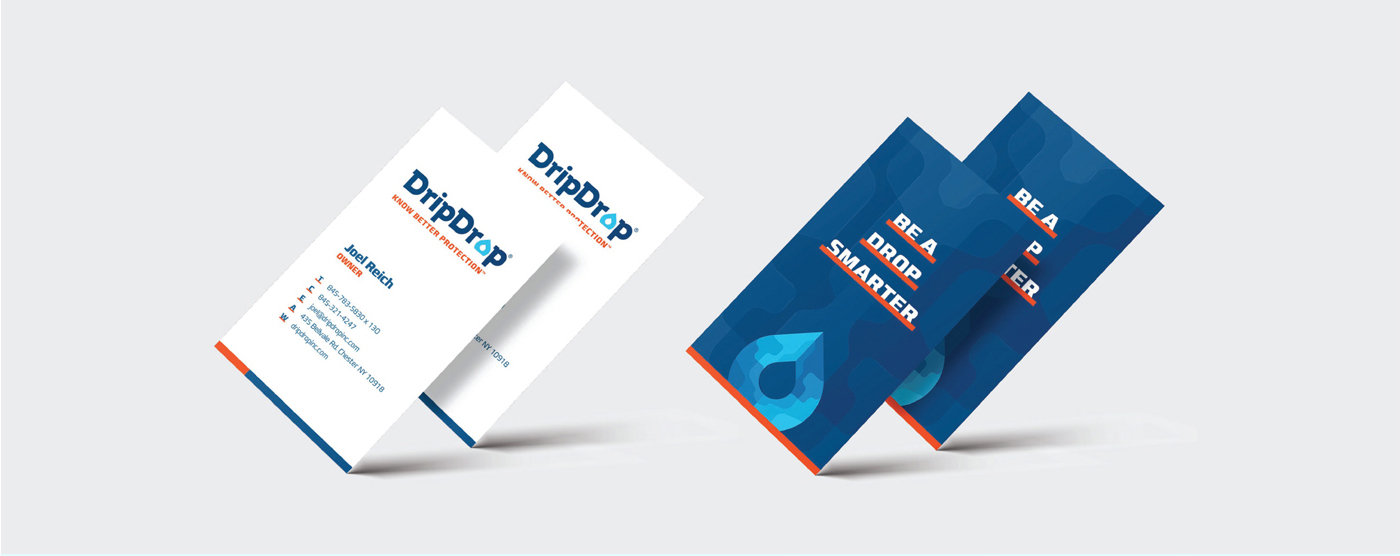
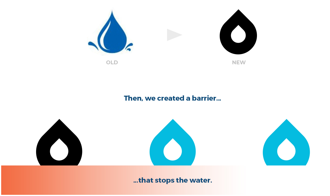
In order to keep the recognition, we used the existing “Droplet” icon, and redesigned it to fit with the new brand feeling.

This is the final mark that will be used as a standalone image, but it’s going to be the secondary identity item. The mark is developed as a standing point for all other letters, matching the style, feel and geometry, to create a cohesive group of hand crafted letters that will be known as DripDrop.
In order to bring our vision to life, we needed to hand craft the whole typeface. We used the letter “B” as a stylistic approach to all other letters.
It’s made as a mix of curvatures and hard edges, with a futuristic twist, making a straightforward approach, visionary feeling, along with professionalism, trust and add human side.
To portray the knowledge, which plays a big part in our story, we used the reference of a brain, that is made out of bits and pieces of knowledge, skill and experience of DripDrop experts.
We combined it with representation of water, as a force of nature that DripDrop embraced, and made them invincible in the field.

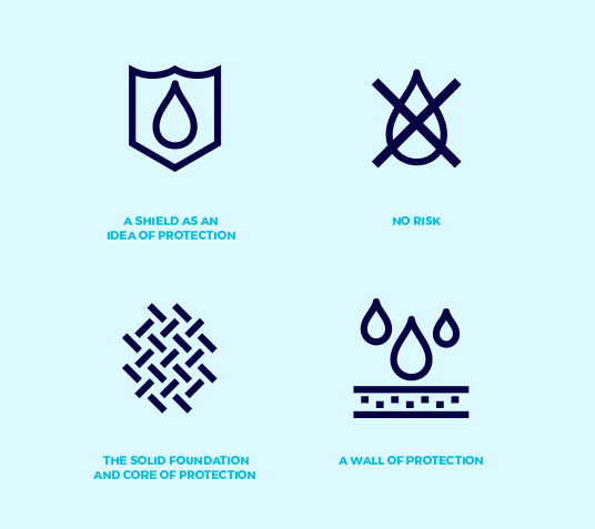
The elements that we used to create the logotype, served for further development of our concept. We have created visuals that combine the water stoppage, knowledge and experience.
The visuals stands to reinforce the brand identity, and put DripDrop in its skillful perspective, giving it the meaning of existence.

To extend the “Water Knowledge” idea, we are using the
icon as a focus visual and mixing it with pattern. That
way we are representing how the water is part of DripDrop’s
skillful and knowledgable team.
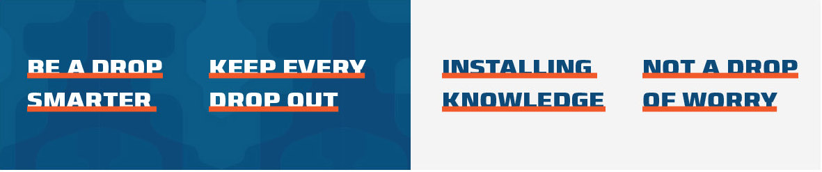
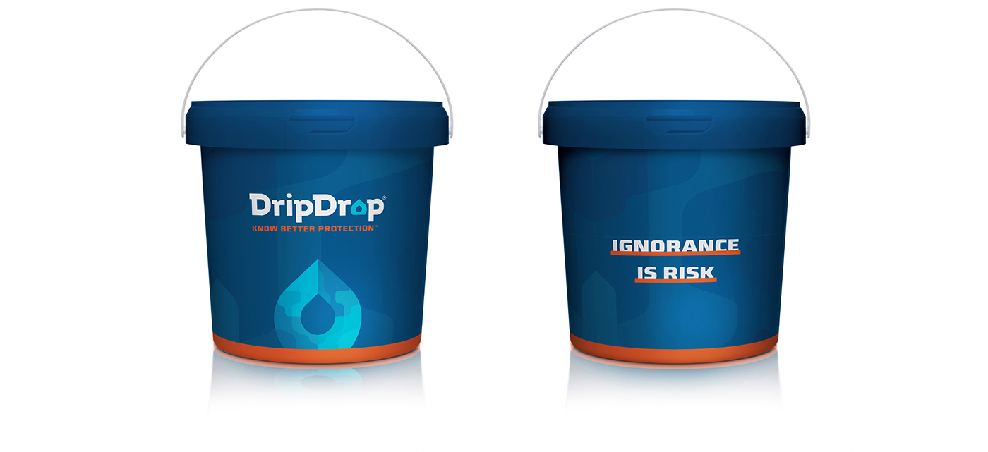
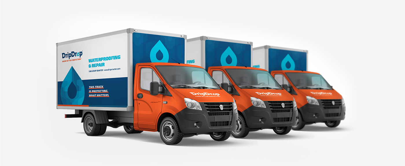
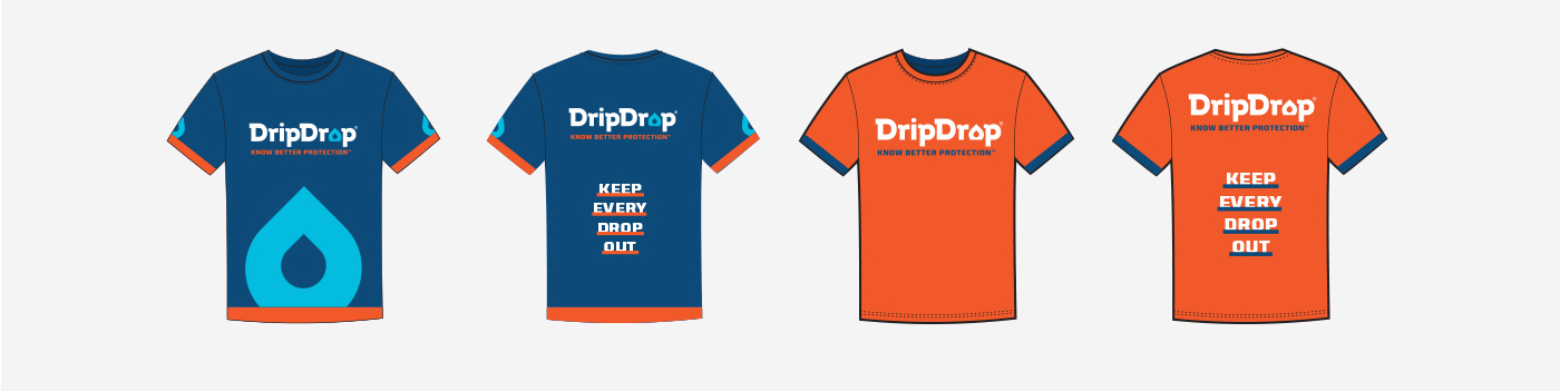
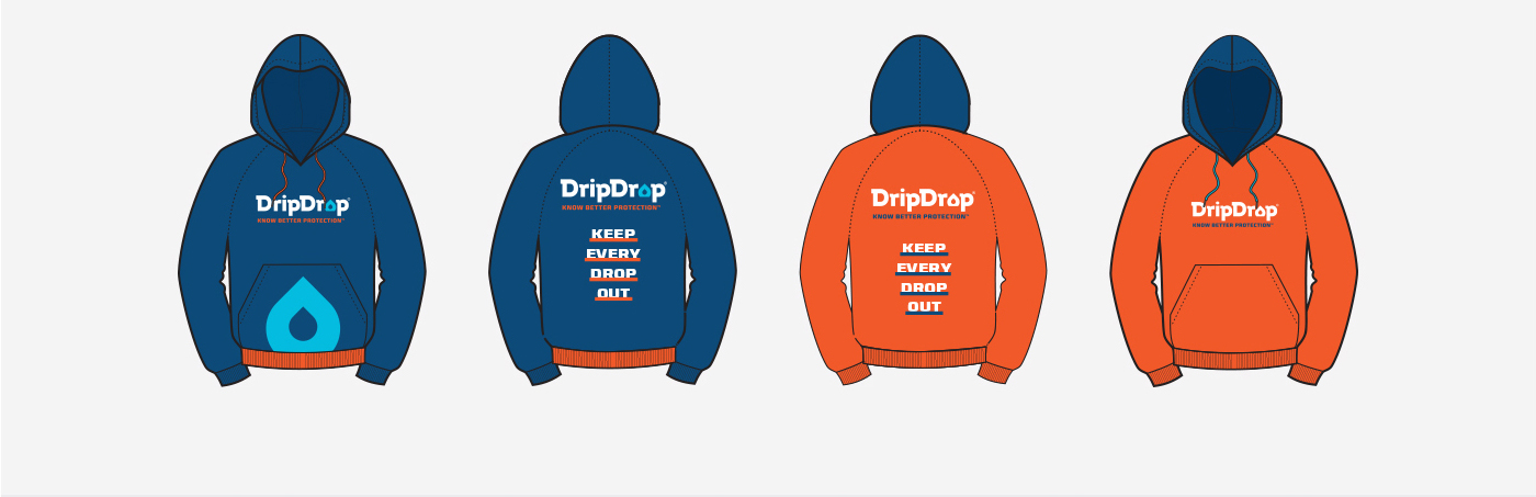
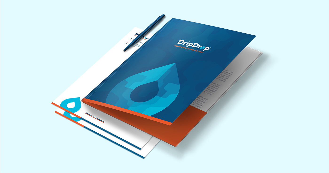
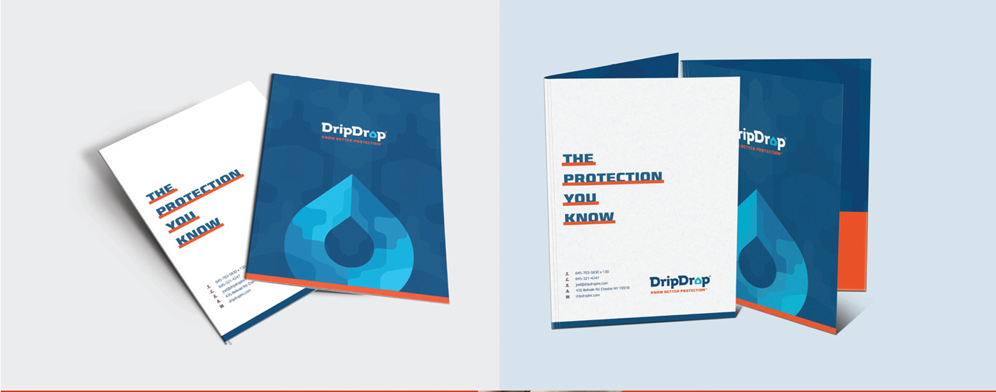
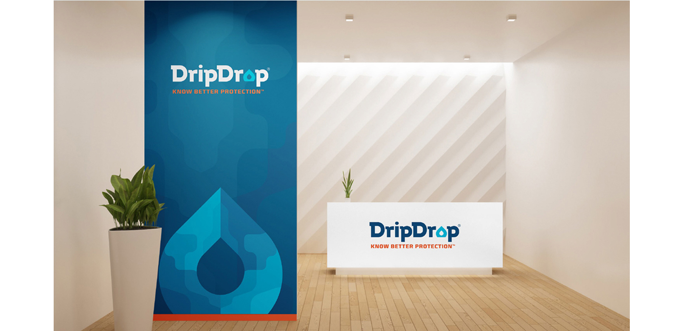
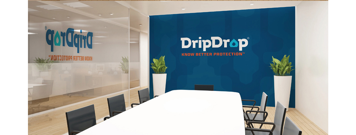
To strenghten the idea, we added the graphical barrier,
presented in orange. It is giving even more credibility to the brand.


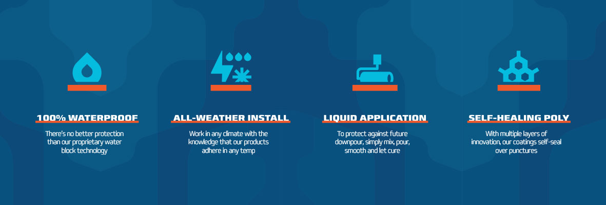
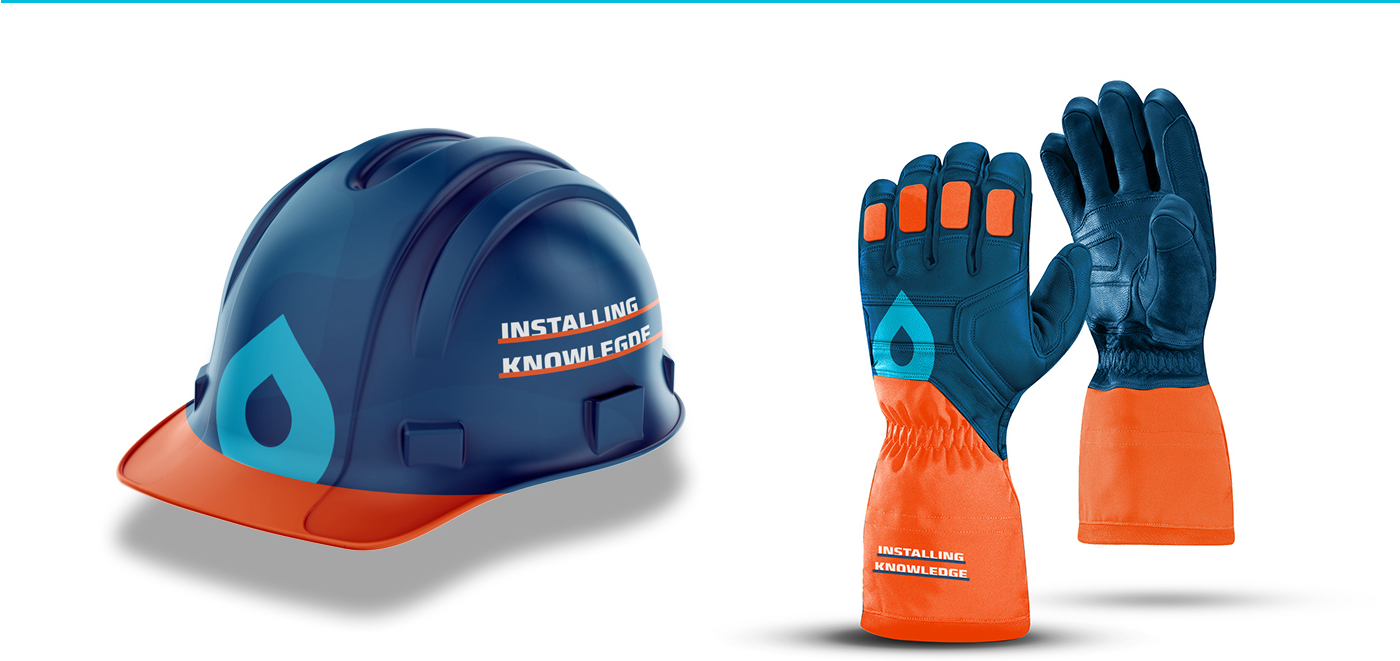
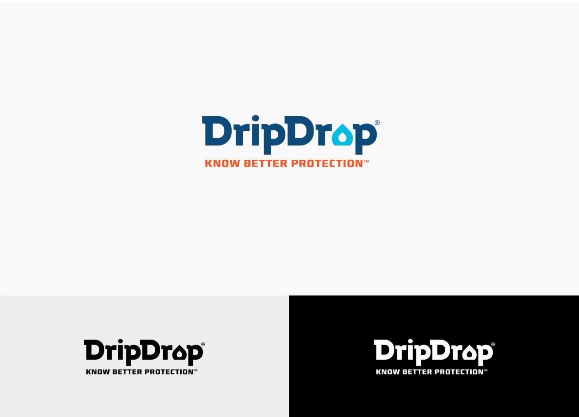
To reinforce the barrier as a brand element of water
stoppage, we are applying it to other graphics.