2016
The total rebrand of Maxi Health was a staggering accomplishment. With our finger on the pulse of contemporary branding and our minds firmly anchored in Maxi’s rich 40-year history, we gave the brand an adrenaline shot that jolted it right into the present— without snipping any of the company’s roots.
Maxi Health Research LLC is the kosher market’s leading nutraceutical company. Sowing their first seeds
over four decades ago, they hardly anticipated flourishing so rapidly. Yet flourish they did. And with
that came a fair share of challenges.
As healthy as sales were, the combination of Maxi’s own growth and fierce competition from younger
brands recently pushed the company to rethink its position. And to focus a microscope on things, they
turned to top local talent: Shia Teichman Creative Agency.
OLD MAXI HEALTH BRANDING
Maxi wasn’t originally built as a brand. They never focused on developing a cohesive image, but
rather formulated quality products and delivered them to market on their own schedule.
The Maxi logo and other visual materials were left up to the experiments of amateur designers.
Subsequently, Maxi’s ads shape-shifted over the years; products were never organized into sensible
categories; images on the labeling were largely unrelated to the actual product; and the company’s
color system for product groups was confusing.
Our job? Establish what the Maxi brand is and what it stands for in a communicable, intelligent way.
We were told in no uncertain terms that we could not deviate far from the current logo. Nor were we
allowed to shift the company’s direction. We could pull the weeds out, but we had to leave the green
grass to grow as it had been.
We decided to do things the hard/correct way: carefully driving vertical improvement without lateral
movement. We chose to fine-tune each element of Maxi’s fragmented identity to yield a fresher,
healthier look without neglecting its existing image. Call it changing direction without changing
direction.
Our key commitment was to age-adjust the logo (by 40 years, give or take!) while retaining the brand
equity and recognition it had garnered over the years. That required a deep reevaluation, and finding
the inspiration hidden in the client's mind took digging.
Was it worth it? You be the judge.


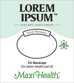
From a number of creative ideas we proposed, the client felt “True to total wellness™” captured
Maxi’s formulation philosophy best. That inspired us to do something truly original and fitting that
would reinvigorate the brand’s product categories.
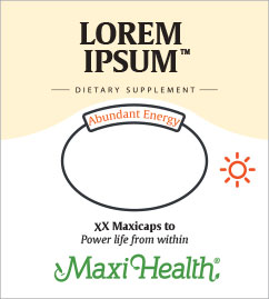
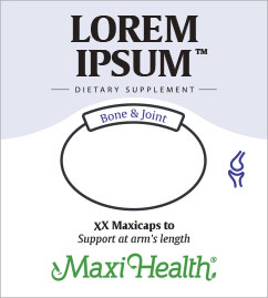
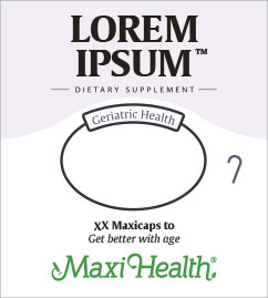
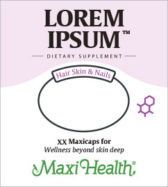
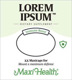
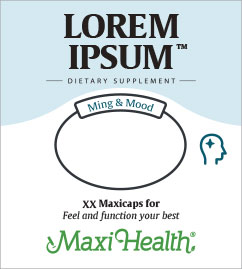
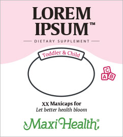
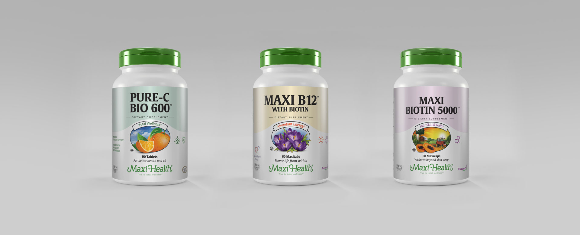
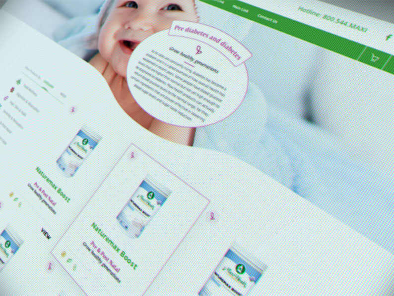
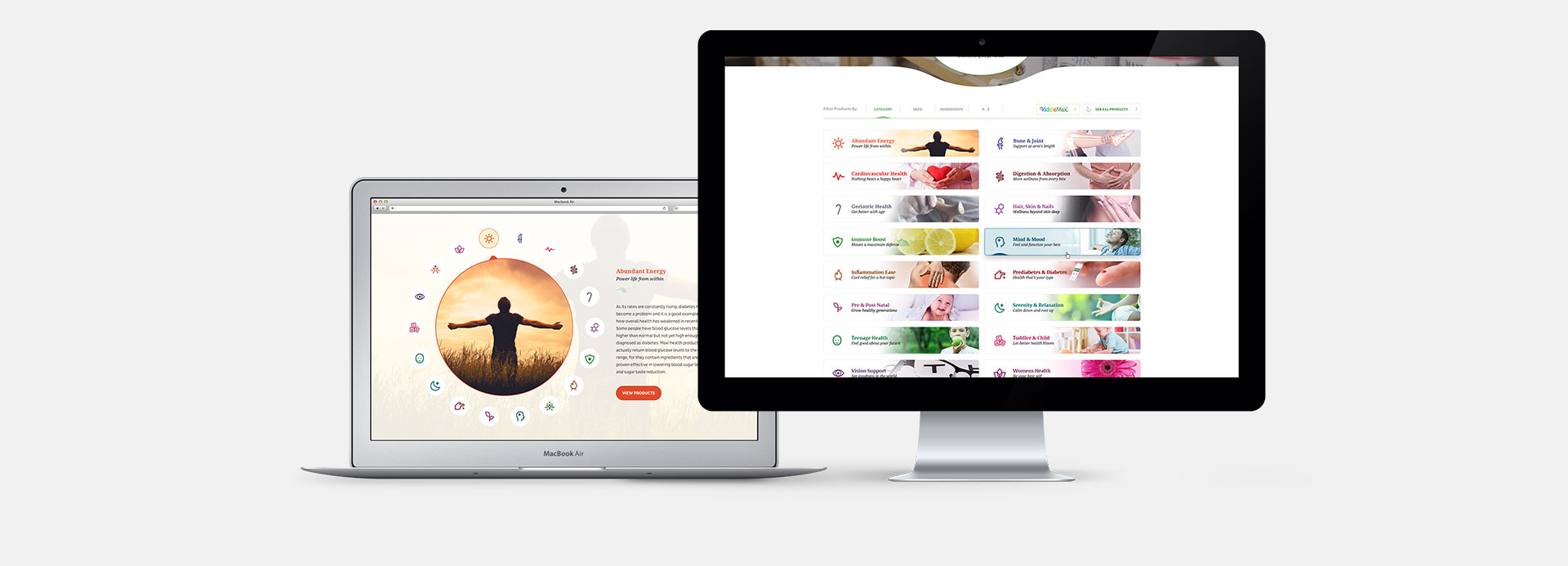
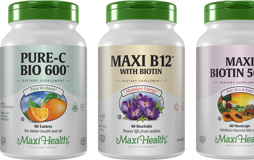
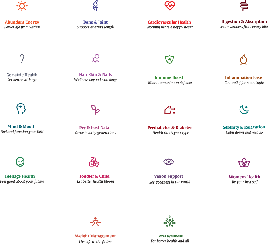
We renamed each category to express, in the simplest of terms, what consumers should expect from the
goods in the bottle. These include titles like “Mind & Mood”, “Immune Boost”, and “Vision Support”.
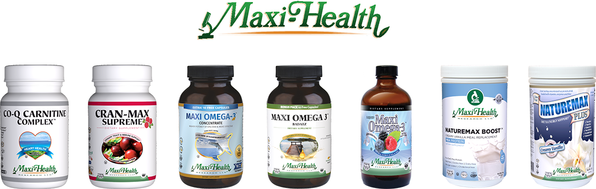
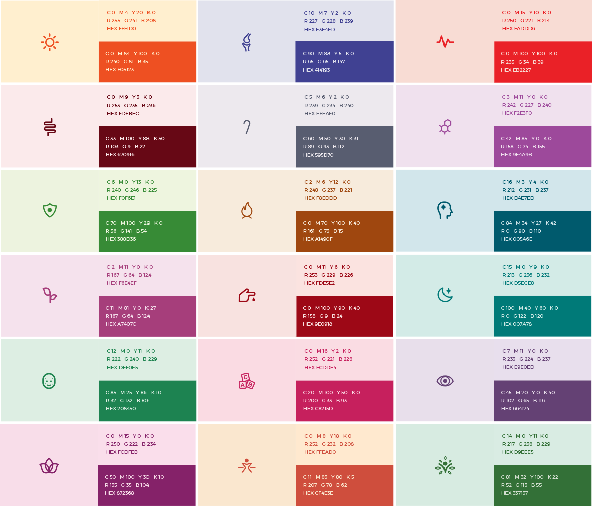
We also developed a color palette and full iconographic platform to visually nestle each product in
its correct category—at a glance.
And here’s the best part: We looked to extend the slogan’s promise to every product and to every
single bottle. To do that we composed creative taglines that express each category’s power and
position within Maxi’s total wellness catalog. Examples include:
- Serenity & Relaxation: Calm down and rest up
- Bone & Joint: Support at arm’s length
- Weight Management: Live life to the fullest
- Inflammation Ease: Cool relief for a hot topic
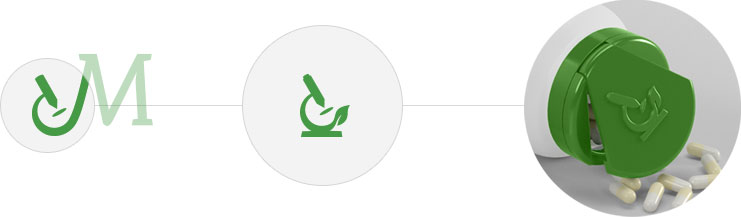
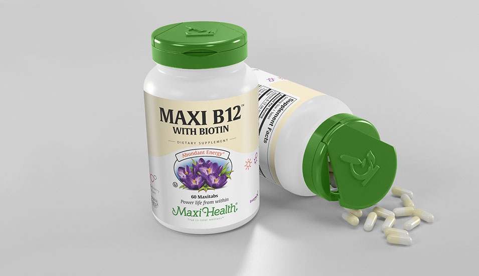
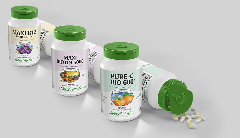
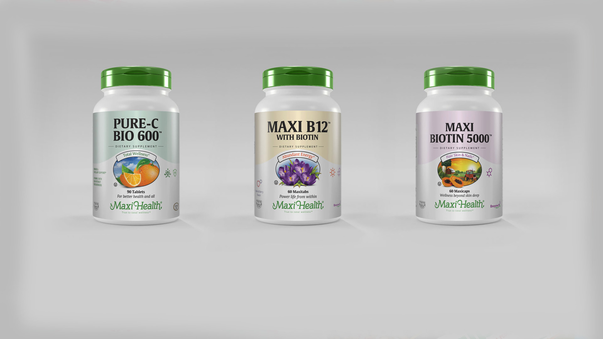
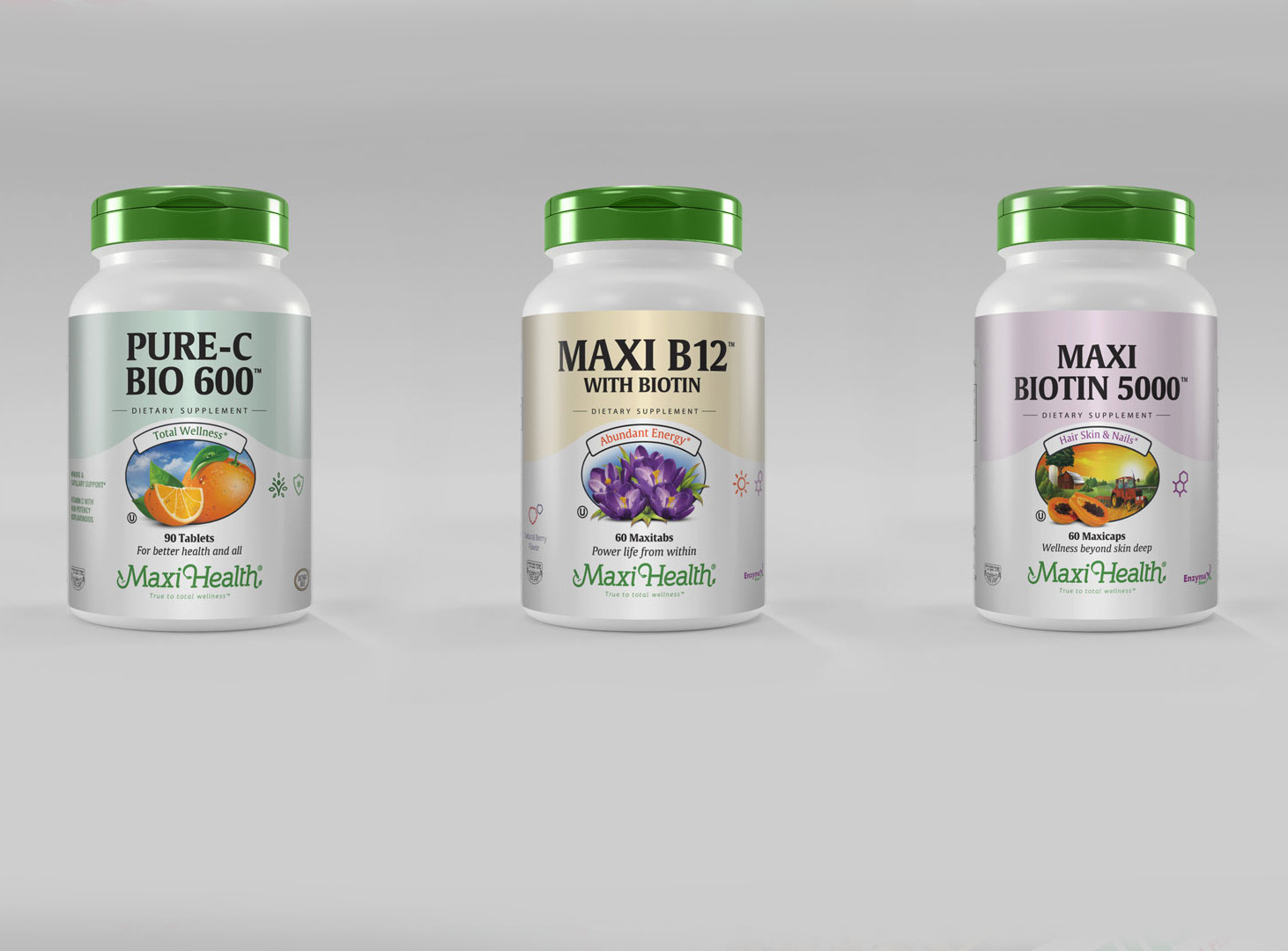
We chose a flowing new bottle shape, and switched the bottle cap to a new vibrant green for immediate recognition and representation of the logo’s leafy attributes. The cap now features a flip top (no screw down) so it can never get lost with daily use.
Rather than paste the full “MAXI HEALTH” wordmark onto the cap, we cleverly borrowed the logo’s left corner and turned it into a powerful, sleek icon in its own right. This is a wonderful achievement, as the bottle cap is now as recognizable as the full logo.
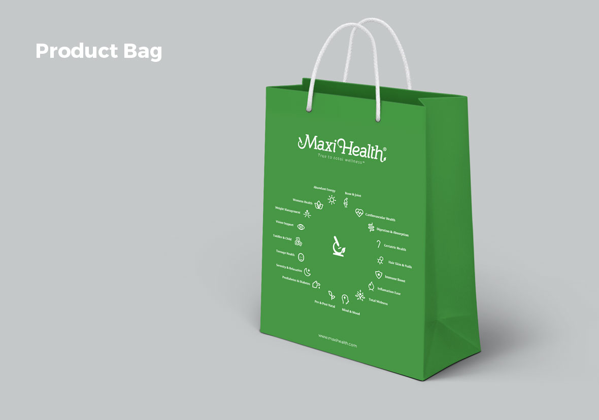
From there we moved onto creating a cohesive labeling strategy, with beautiful imagery, color blocks, and product illustrations that leave no doubt as to what’s in the bottle. For the first time ever, the Maxi brand can say it has a professional, consistent iconography and labeling platform.