2018
Usually, the parents don’t want their children's, help. Because they don’t want to feel powerless. Talking about it is a headache caller, and doing something about it, is even more. In their best intentions, the children get a very stressful experience, instead of a loving one. They have their own.
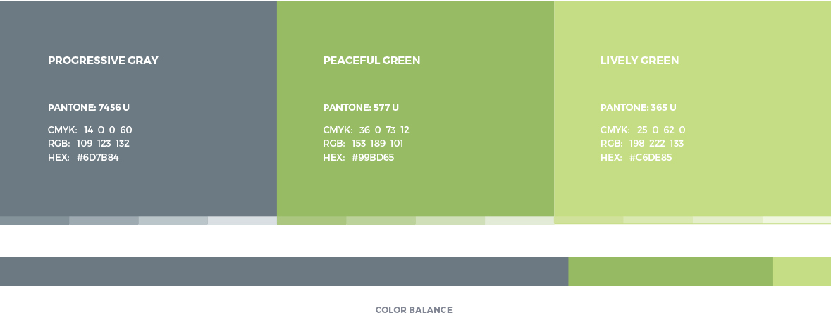
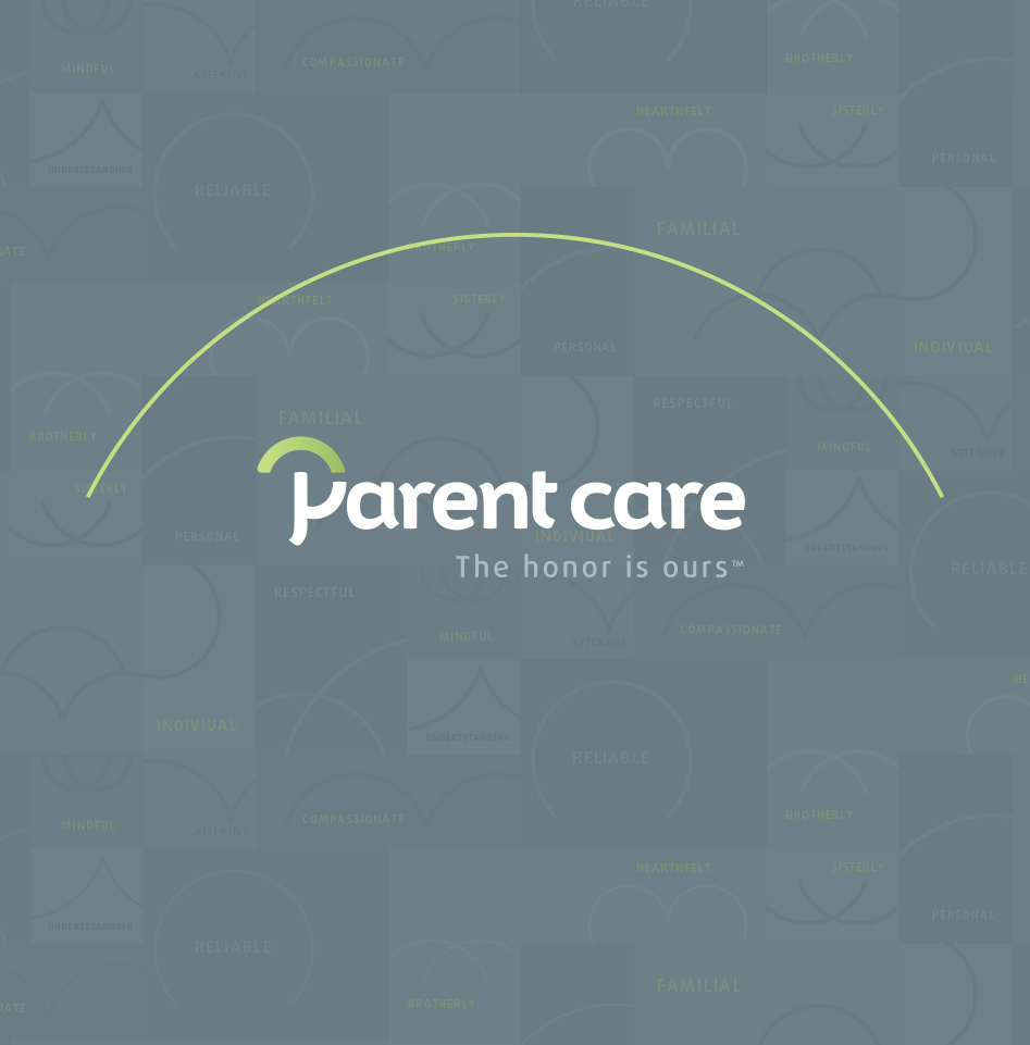
We envisioned the Parent Care brand
being serious and corporate,
yet a caring and loving brand. It's
showing the pride in the services, as
well as the professional treatment of elderly.
The brand identity wasn't built in the typical
fashion. We've seen a lot of the same brand
identities for home elderly care, so we were
very glad that the client noticed that, and wanted
something completely different. That is why we
were excited to create something original, and change
the industry perspective.

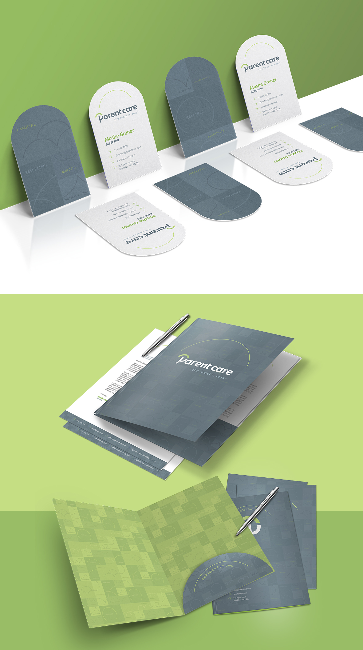
Like we've previously mentioned, we took a different route. Instead of having regular representations of family and care, we went for something out of the ordinary. We went searching for feelings, atmosphere, things and objects that represent the best care that there is for our loving parents. After all, we need to give something back to them. And what better than the years they took care of us, but with a twist - a stress free experience.

The hands that are protecting a family. Sounds simple, but there is more than meets the eye. We thought of the concept as a metaphor to umbrella. Imagine an adult child and his parent walking down the street on a rainy day. The child is the bearer, and wants to protect his parent from rain. They smile, mother is holding him/her on the hand, staying close to each other... It is a very close moment that reflects how much they love each other, and that they are not letting negativity pouring into their lives. This is what we see Parent Care brings into the homes. A sense of family, care and closeness.

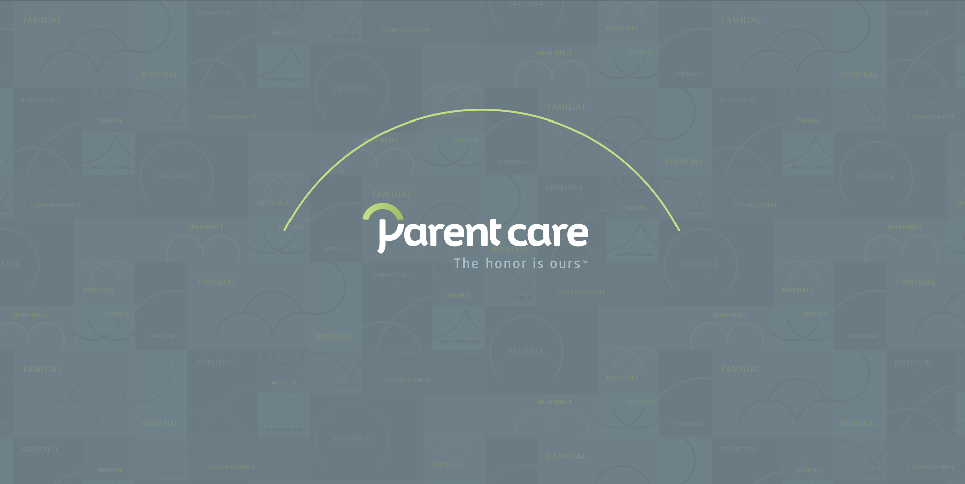
We asked ourselves: “what would represent everything we talked about, without being like every other home elderly care there is? How should we make a unique symbol to stand for not such a unique business?” We didn't have the answer, so we dug deeper than the deepest ocean. Then, another question came: “How about we put sunshine into everyone's world, without having the rain disrupt the harmony?” This time, we had our answer.

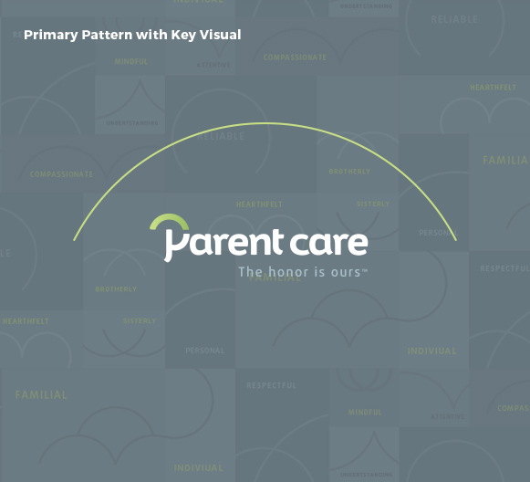
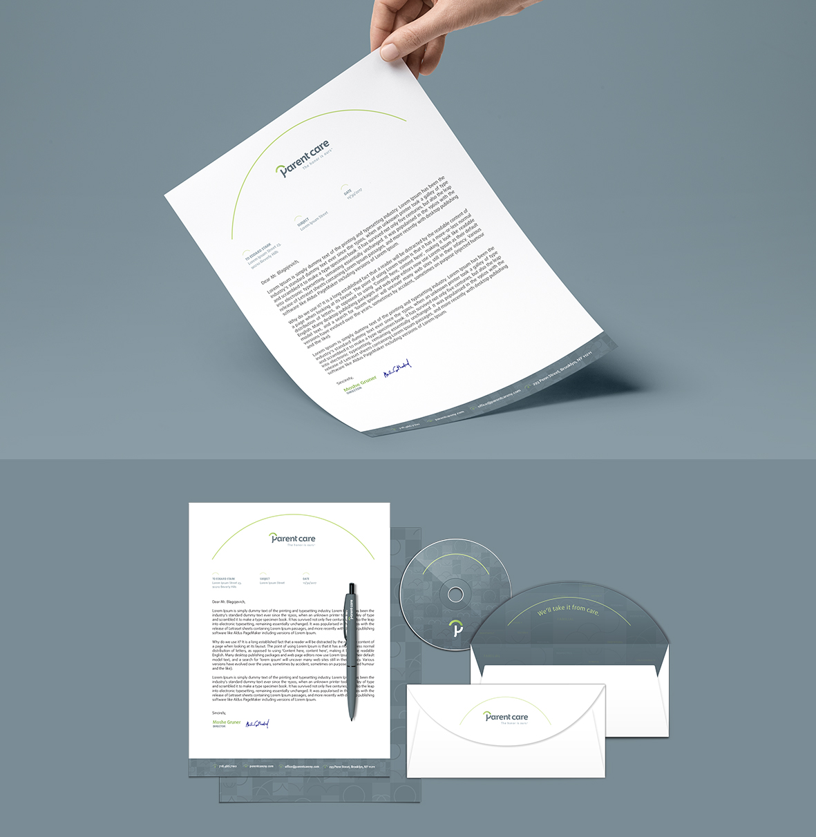
As the main graphic element, it represents the caring and
protecting hand, which is a metaphor of the roof, where family’s
physical and mental health is taken care of. It brings closer the
people inside, while getting protected of the negativity. There’s no
room for stress inside the dome. It’s kind of a sanctuary, where
everybody feels good about one another.
The second meaning is the sun on the horizon, which represents a
certainty of relaxing experience for both, children and the parents.

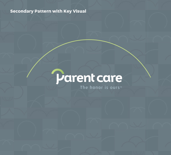
As secondary graphic element, we used the idea of an umbrella. It's there just enough to to portray the idea of closeness, even more care and have a unique distinction.
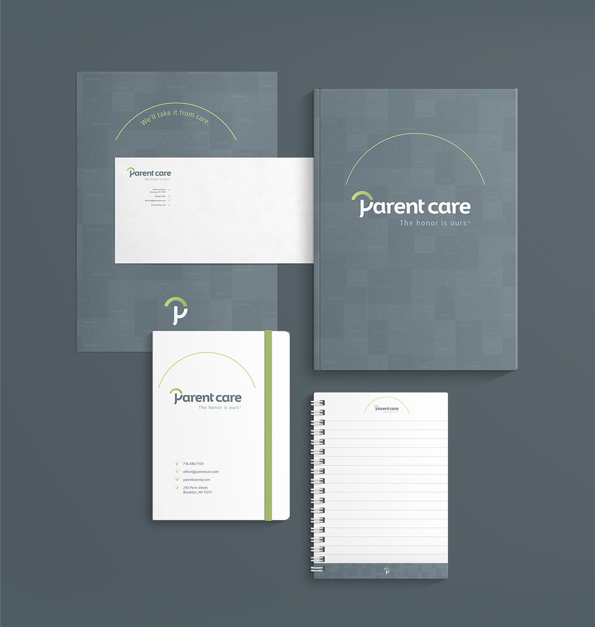
This is the final mark that will be used as a standalone image, but it’s going to be the secondary identity item. The mark is developed as a standing point for all other letters, matching the style, feel and geometry, to create a cohesive group of hand crafted letters that will be known as Parent Care.
In order to bring our vision to life, we needed to hand craft the whole
typeface. We used the letter “P” as a stylistic approach to all other letters.
It’s made as a mix of corporate and family side, to appeal to customers
that seek professional and trustworthy services, while knowing they are
getting the home service with a friendly face, proud to serve and act as
a family member.
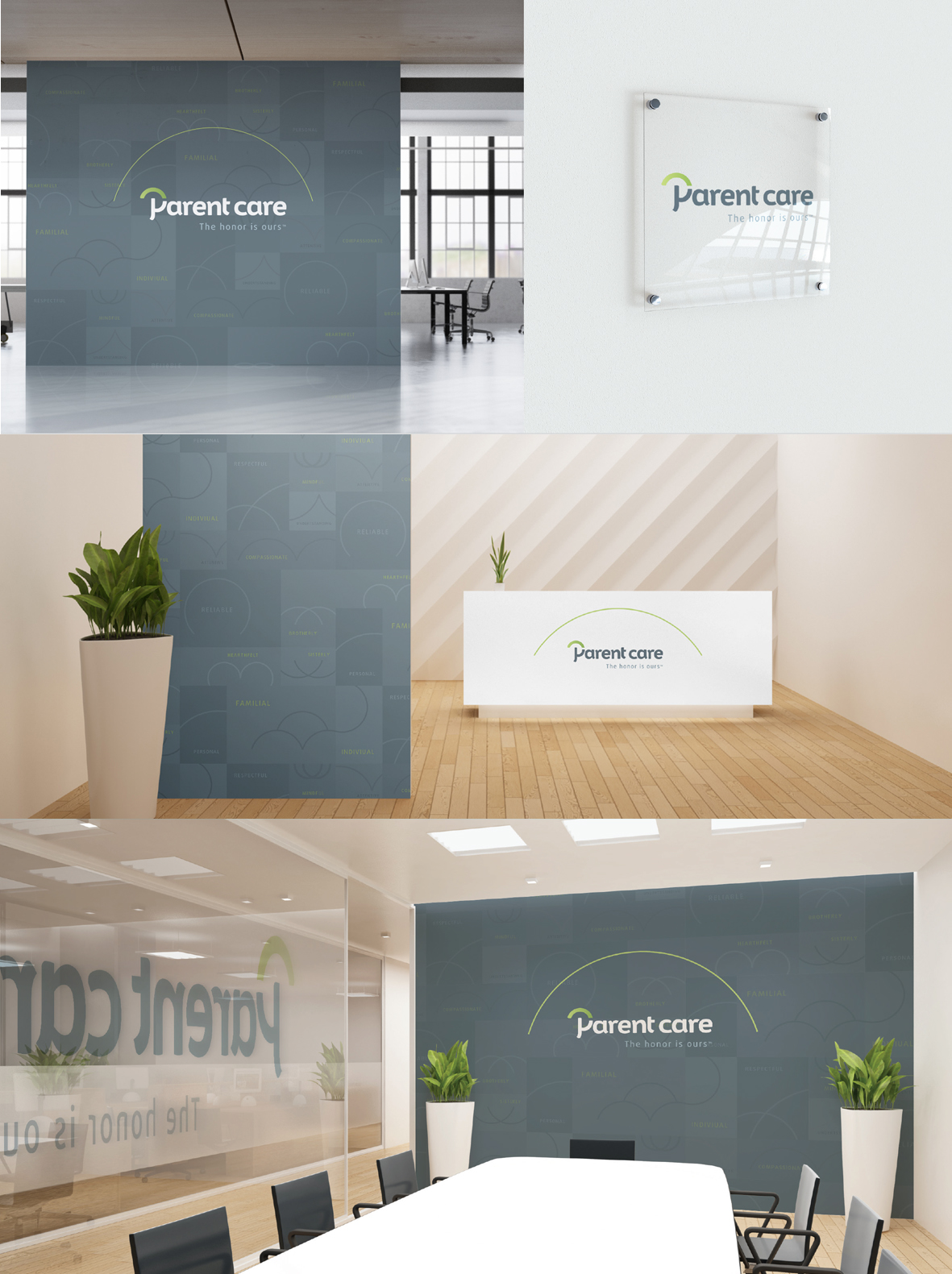
The elements that we used to create the logotype, served for further development of our concept. We have created visuals that seamlessly combine the aspect of care, protection and emotion with a corporate feeling.
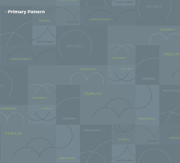
For every keyword of the brand vaules, a set of icons has been created. Those icons are intended to work within the pattern, to clearly speak about the values, with icons as a supporting graphic. Icons are made out of the “Dome” graphic and act as an extension of it.
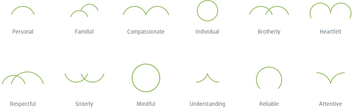

Key visual acts like the extension of the dome
graphic from the logo. It follows the logo
everywhere it goes, as well as other graphics.