2016
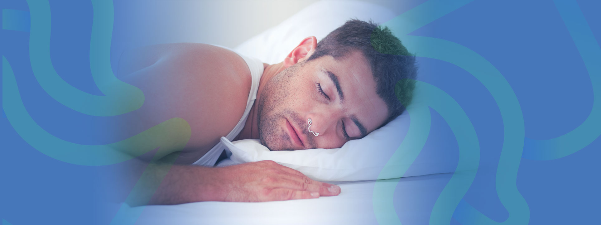
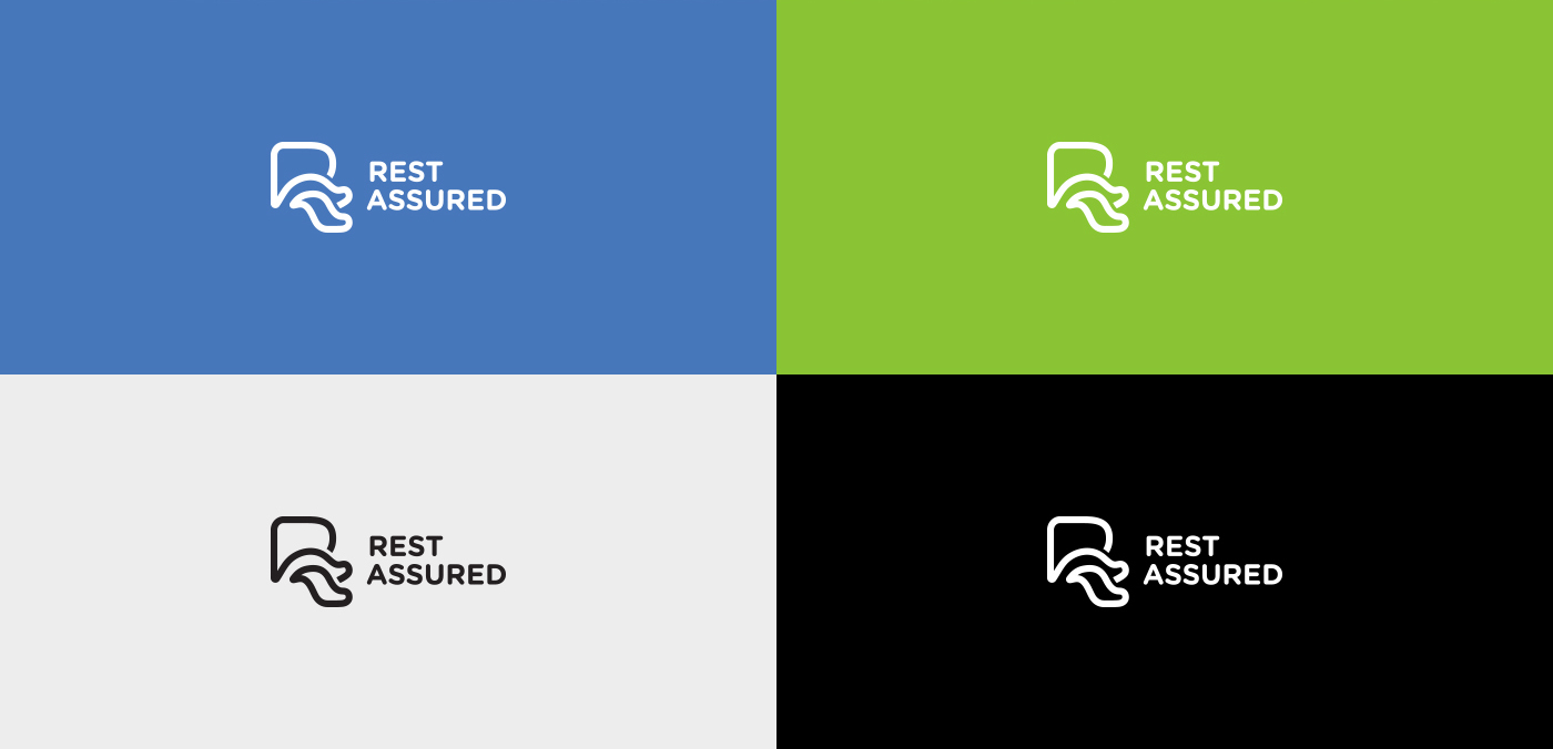
The comfort, ease, and security of a good night's sleep, what could be better? To develop Rest Assured's brand identity, we combined peaceful visuals and a professional identity to promise customers the right fit, the right choice, and the right step for better, healthier sleep.
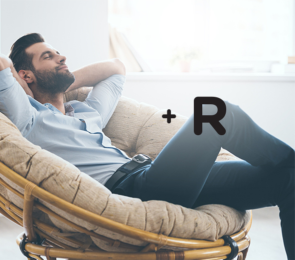
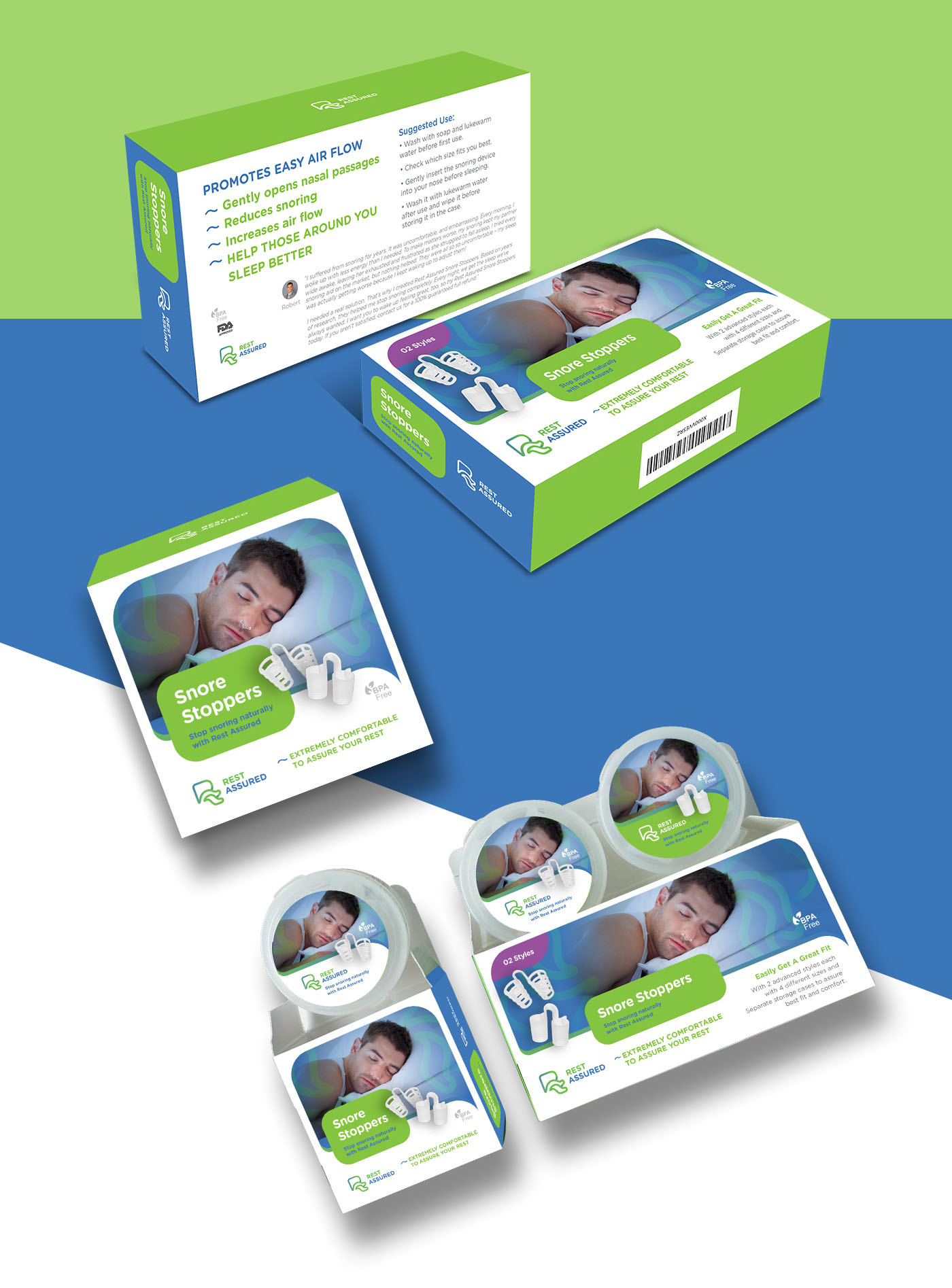
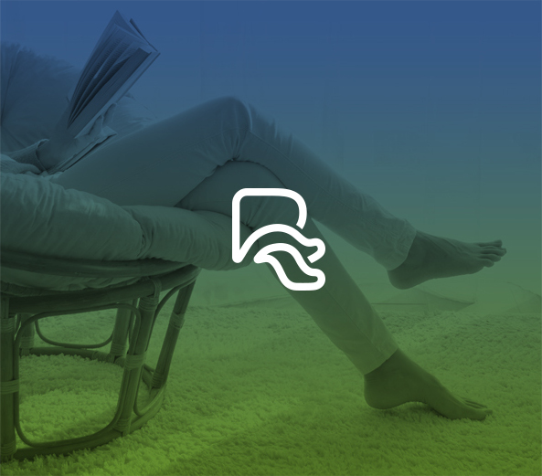
The brand's logo and name work together to focus on the reliability of Rest Assured and the confidence of the right solution for snoring and sleep issues. Just as Rest Assured's name communicates both a refreshing night's sleep and confidence, the logo combines a relaxed image with an iconic image. With the letter "R" cleverly designed in the shape of crossed legs, we conveyed the relaxed pose of the happy customer while keeping the logo closely aligned with the brand name itself for a memorable, marketable impression.

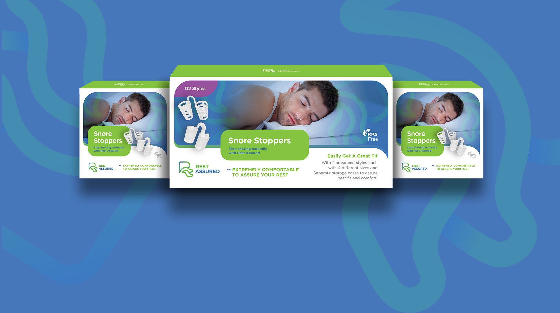
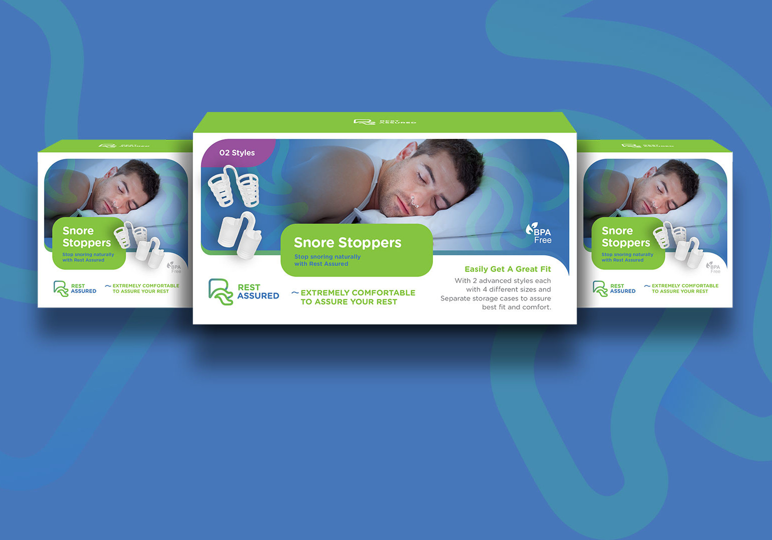
With the relaxed lines and soothing colors of the brand identity, we developed packaging for retail and online sales that would strengthen the brand's promise of peaceful sleep. Using the logo design as the background, the packaging promotes a serene, trustworthy solution in a package design sure to catch a customer's eye in the crowded store aisle.