2017
Built on a sturdy reputation and customer base, Tigerlok's brand identity was ready to be scaled-up for the next stage in business growth. Focusing on a modern redesign while staying true to Tigerlok's rock-solid image, we picked out the best of the brand elements to create a stronger, more recognizable, and timeless brand impression.
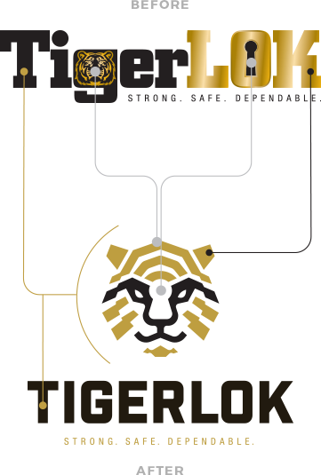
When we met Tigerlok, we met a brand built on strong products and customer value. But compared to their success, we knew the Tigerlok brand identity wasn't keeping up with the pace of their growth--and would continue to fall behind. Rather than touch-up an outdated design, we partnered with Tigerlok to relaunch the brand into the modern market. Reliability. Elegance. Boldness. Strength. With the grace of a feline and the power of a tiger, Tigerlok would stand proud as leader of the pack with an impressive brand identity behind them.
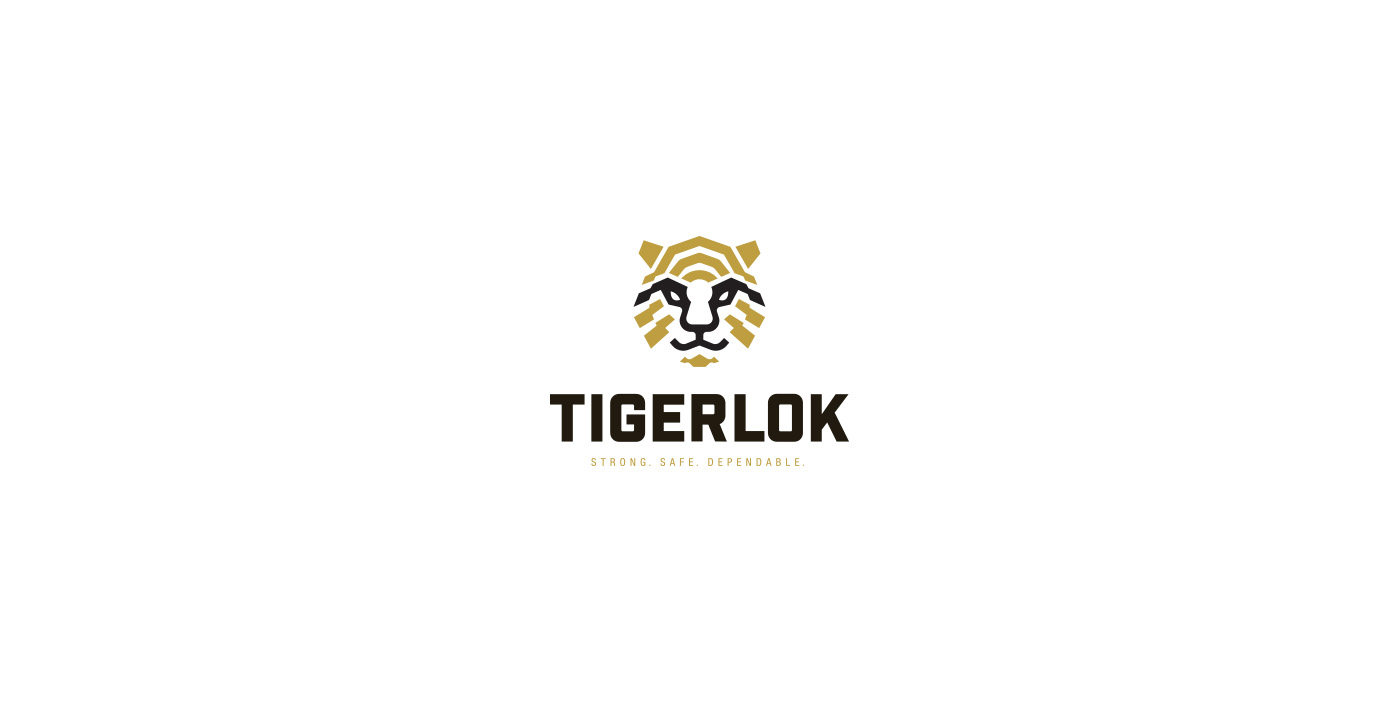
With a name as good as Tigerlok, we knew that the key would be a visually stunning combination of their product and animal namesake.
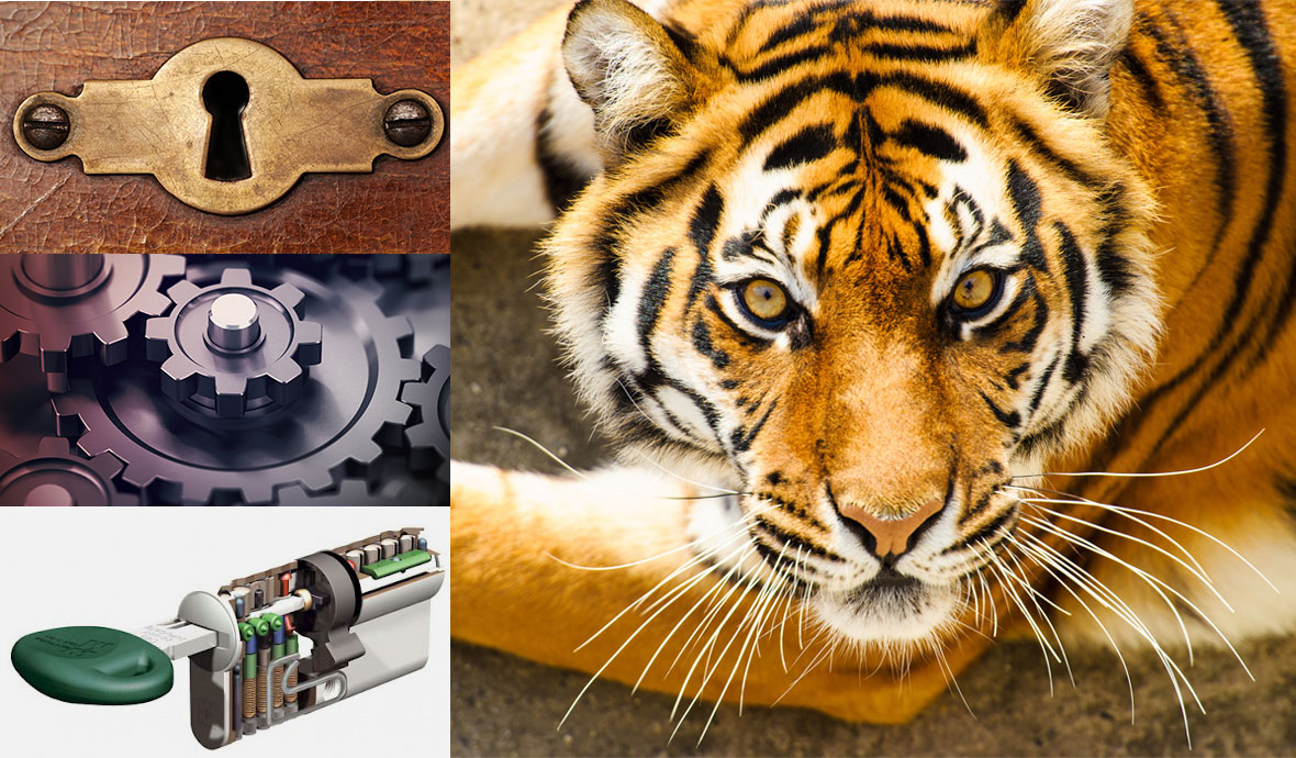
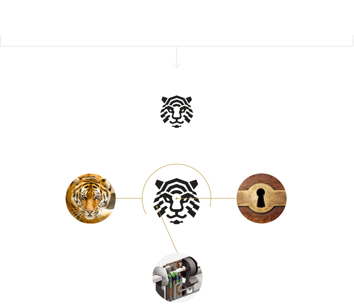
The old Tigerlok logo had two focus points: the animal and the keyhole. We took two distinct identity points and merged it into one creative visual. The logo we designed boasts a tiger head cut out of a lock's cylinder mechanism and a lockhole shape in the image center.
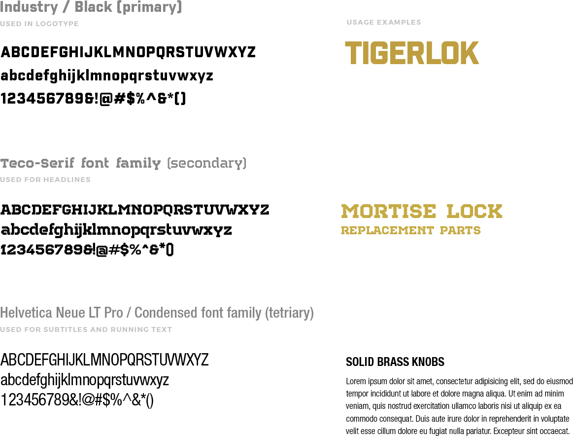
The typography mimics the sharp angles of the old logo, with crisp edges to communicate strength without compromising readability.
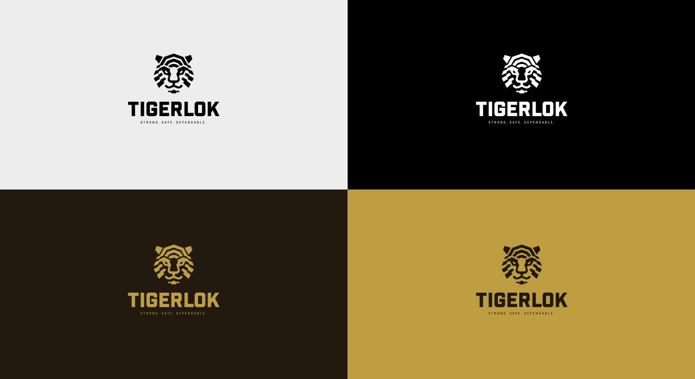
We flattened the gold gradient to a middle color value, for a visual appeal that translates easily across platforms.
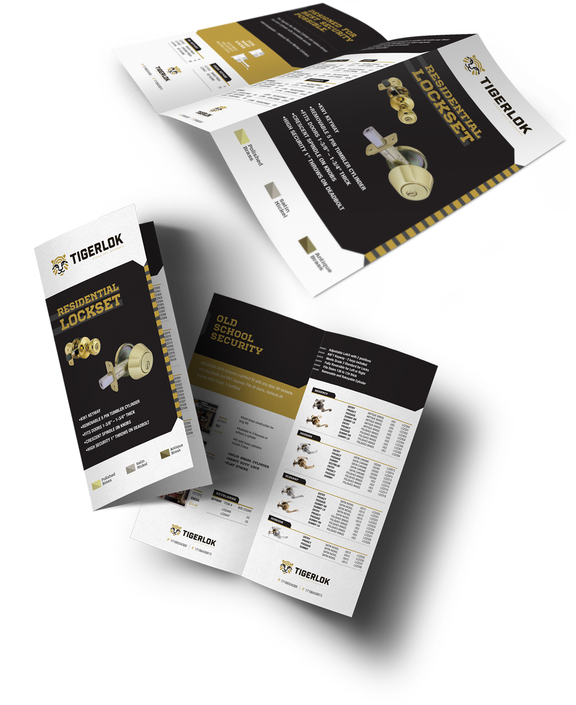
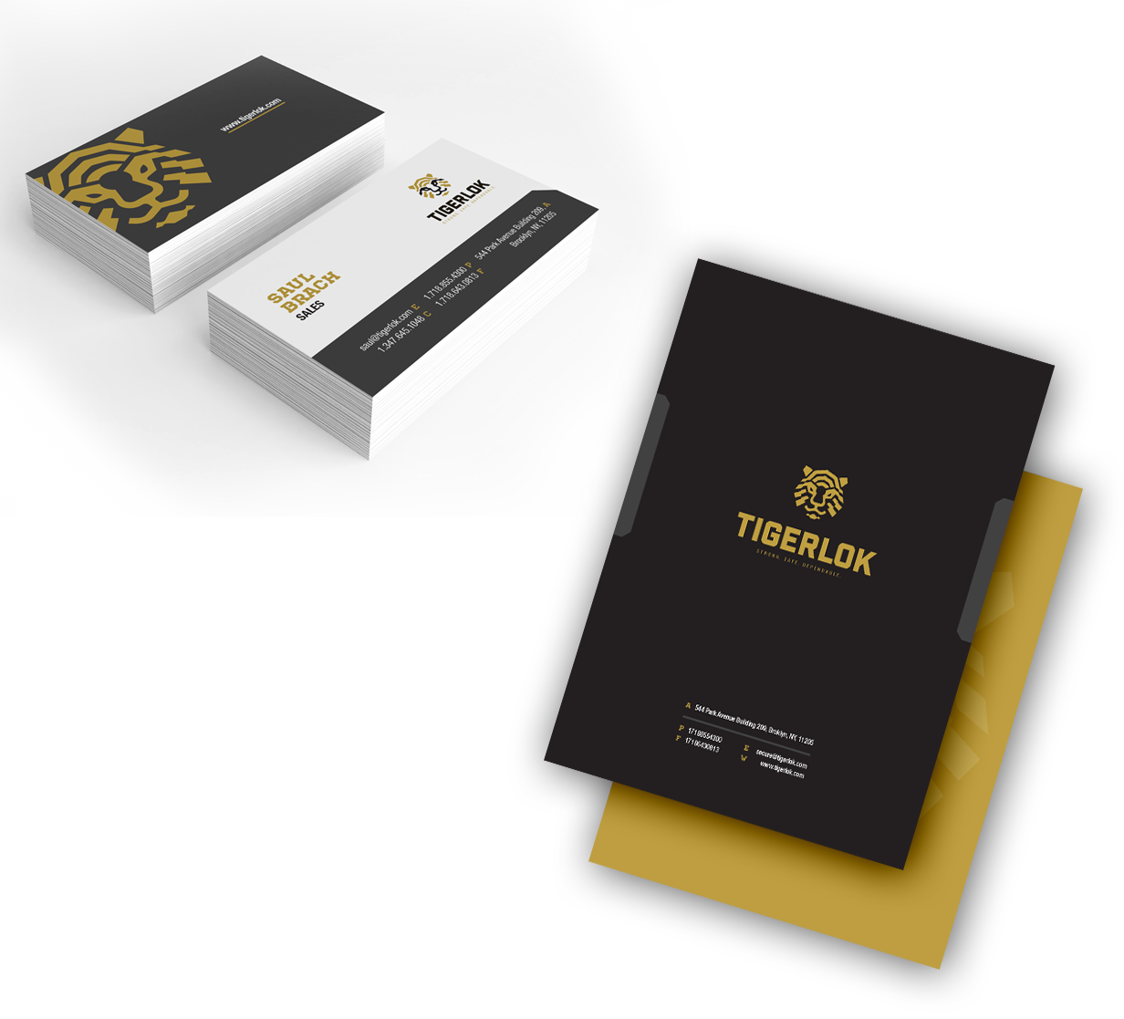
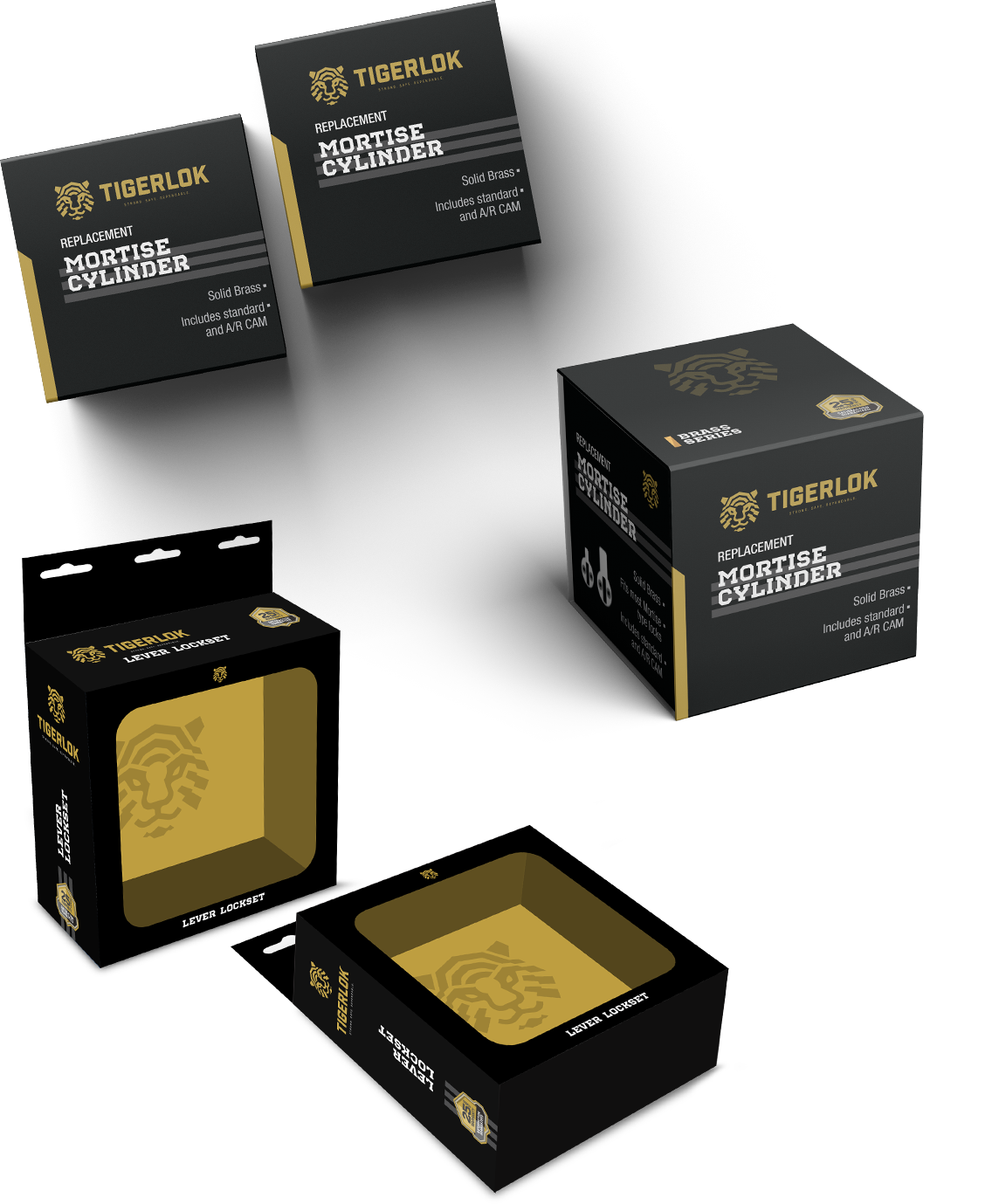
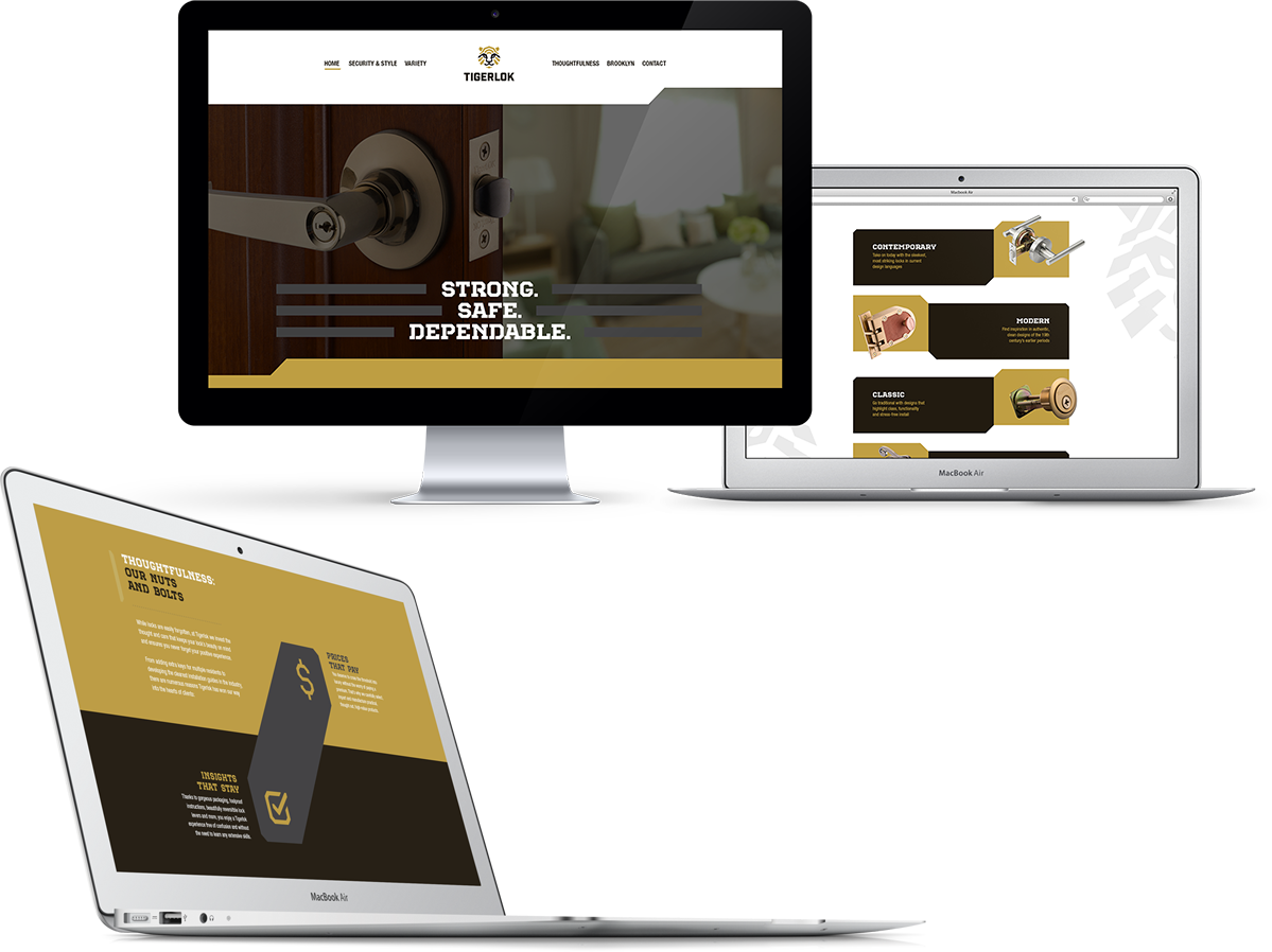
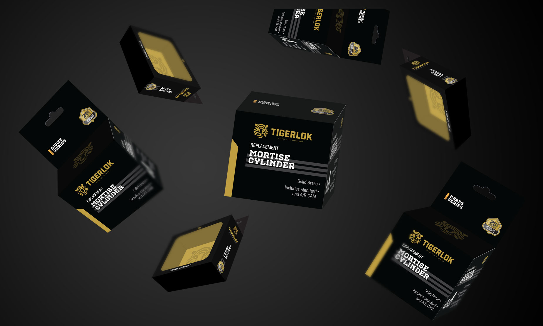
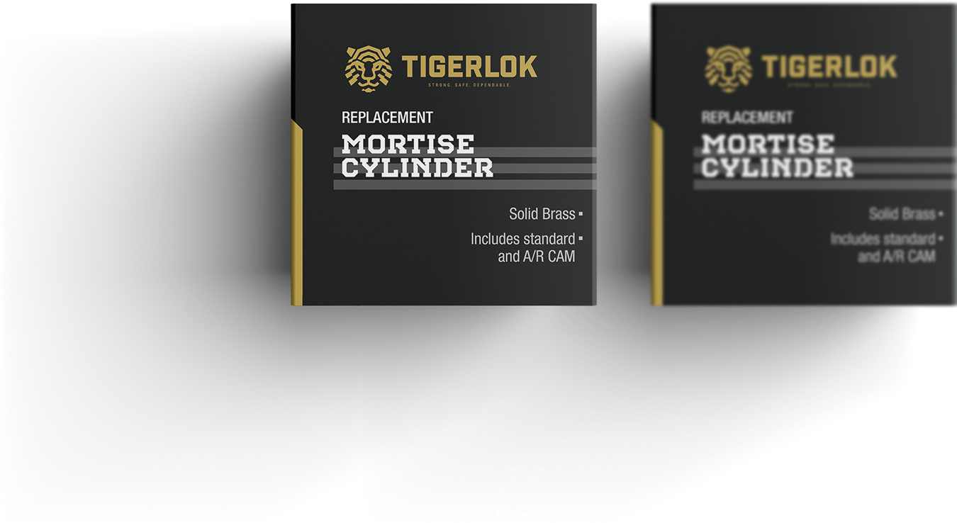
With a new brand identity behind us, we redeveloped Tigerlok's brand materials: packaging, stationary, brochures, and website.