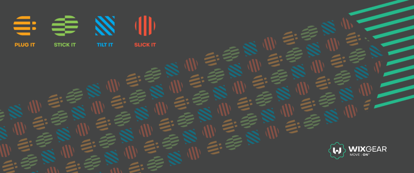
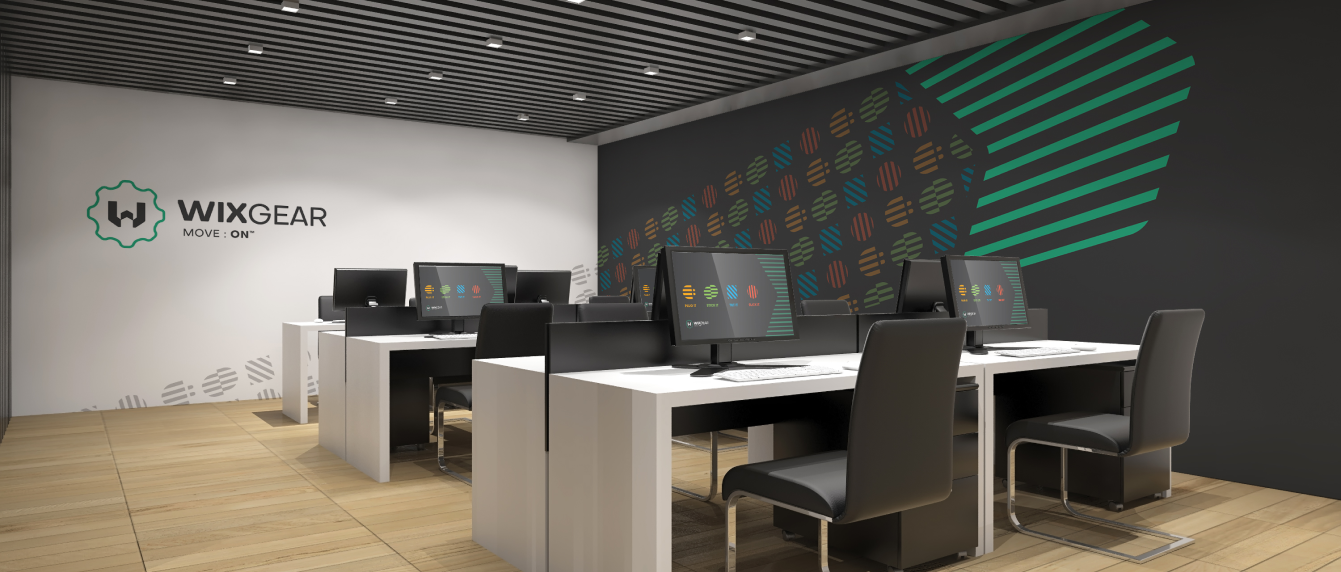
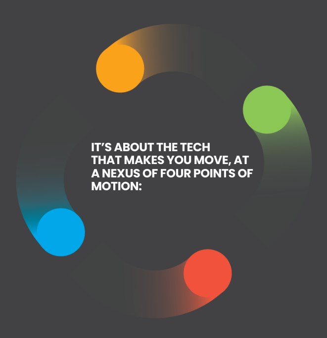
back to top
header img header img

Branding Identity

for WixGear

2018

Our Approach

We envisioned WixGear as a brand that speaks to the constantly moving, on-the-go technology world, embodied-in-everyday-life consumers, whether it is related to car accessories, chargers, sports or office people. It is a brand that keeps us striving for improvement of our evolving cyber-active lives.

Today, we are in a constant state of going, and we expect our tech to go with our flow, so that we can plug it, stick it, tilt it or slick it anytime, anywhere and anyway we want.

A unique problem

FROM WIZGEAR TO WIXGEAR

The company faced legal issues with the name, so they needed to change it. They renamed WizGear to WixGear, and, along with that, they wanted a fresh start and new brand identity.

Inspiration

LIFE IN MOTION

Our concept of the brand identity leans on the idea of what WixGear is all about - life in constant motion - because it's not enough that tech is designed to go with us.

The on-the-go lifestyle is changing the way we operate, so WixGear is here to embrace that change and become our constant companion.

CRAFTSMANSHIP

For the brand to embody artistic craftsmanship and customized features, we drew inspiration from all over and boiled it down to the essence of custom artistic furniture.

EMBRACE

header img

To live it, you must embrace it. The good thing is, we already did. We are just not aware of it yet. WixGear comes in to play, to tell the story of awareness.

THE ARROW

header img

Arrow, as a forward-striving graphical element was the obvious choice for a part of inspiration. It represents the direction, movement and demands going forward. Just like our lives in relation to technology.

THE MECHANISM

header img

The unavoidable part of the branding is the mechanism that drives us. It’s within us, it keeps us moving, and represents our philosophical relation to technology, because without thinking about it as the part of our bodies, there would be no WixGear.

Logo Design

To create the logo, we fused the inspirational aspects of the brand and made a unique, memorable and modern identity that wraps around our story.

img img img img img

Colors

img img

Typography

img

Iconography

img

Key Visuals

FOCUS ELEMENTS

FOCUS ELEMENTS

Alongside the logo, we have made graphical elements that emphasize the branding's main focus points. They serve to enforce the visual identity, to complete the entire image, and to add to the uniqueness of the brand identity.

img
img

These are a unique set of symbols that describe each point, with simplicity in mind, but with dynamic style which feels like it’s constantly moving. It's the fine line between abstract and descriptive that makes them bold and memorable.

Key Visuals

PATTERN DESIGN

The Harbingers

To create the patterns, we used the “Four Points of Motion” as they are the harbingers of the new WixGear identity. They are constantly moving, creating a dance of the nexus throughout the identity.

img
img

Key Visuals

THE ARROW ELEMENT

Striving Forward

This identity would be nothing without the arrow graphic, taken from the logo. It’s not just any arrow - it’s a motion-driven arrow, leaving a mark on anything it passes by.

img
img

The arrow is made in the same style as the “Four Points of Motion,” with lines striking through it, to complete the relationship between them and to have a cohesive brand image.

Main Key Visual

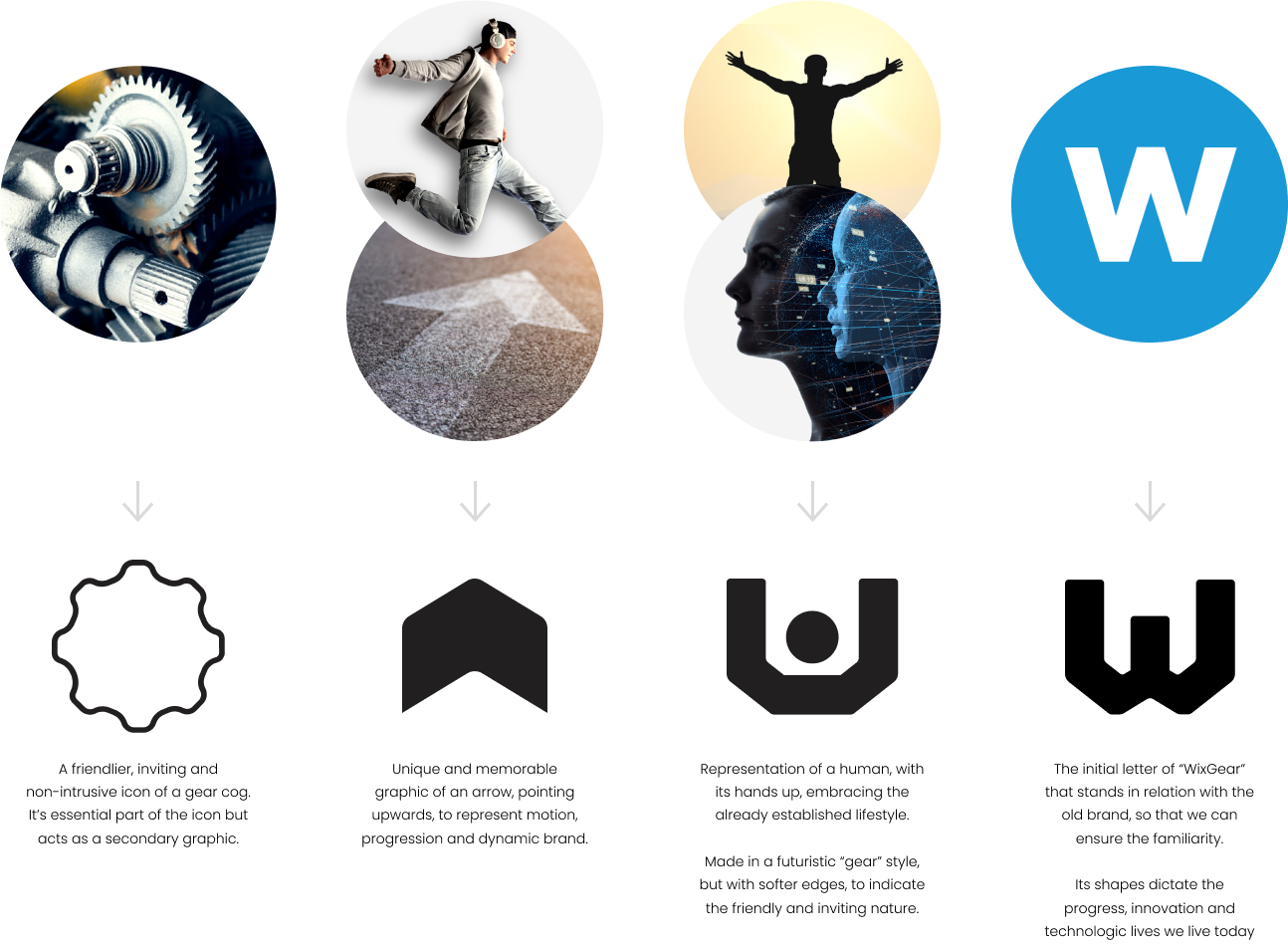
THE TRACE OF WIXGEAR

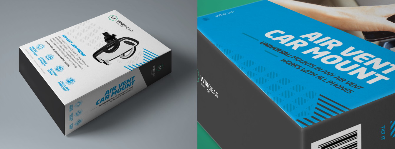
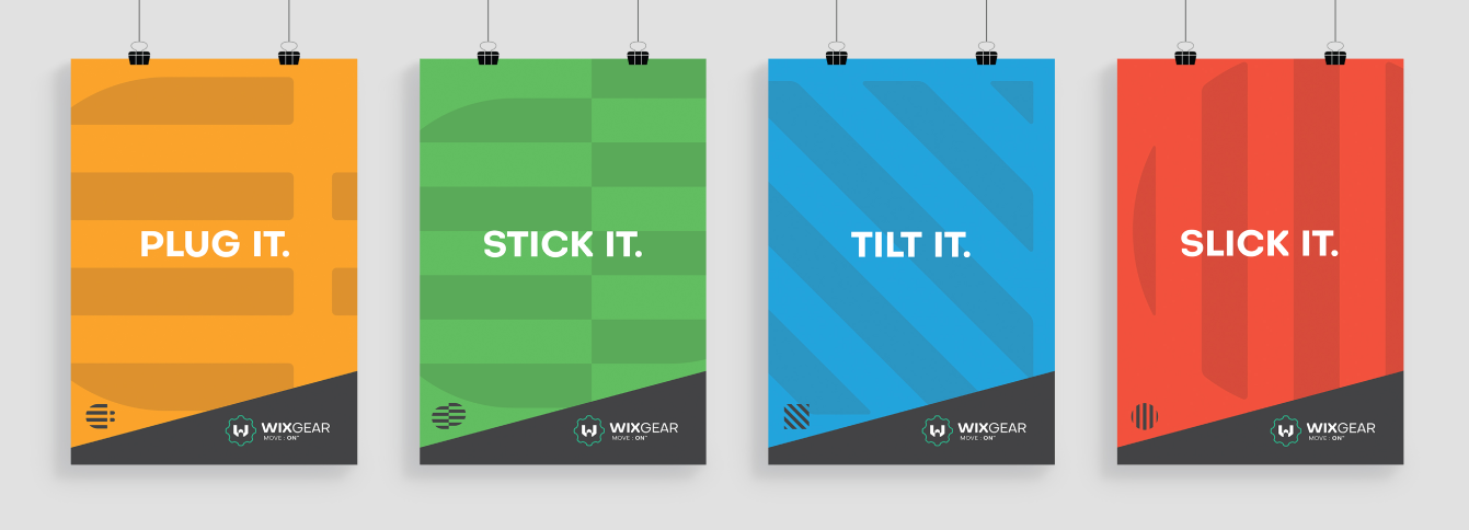
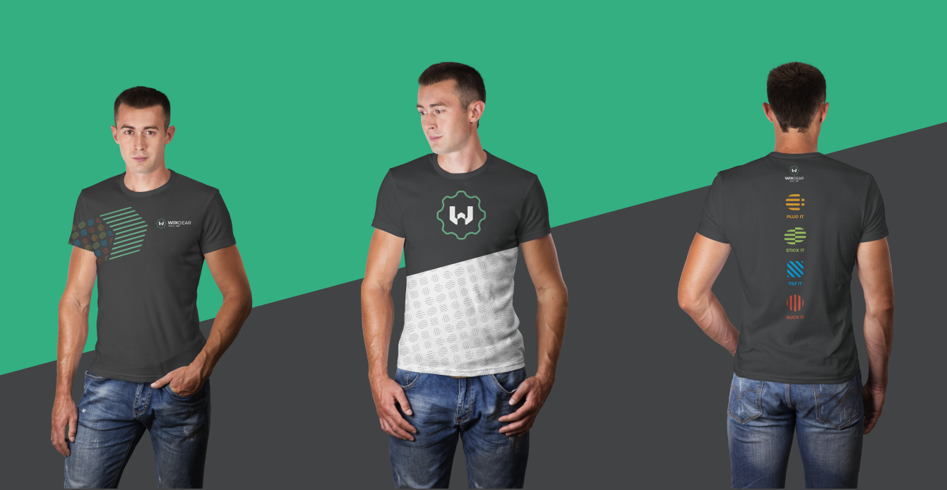
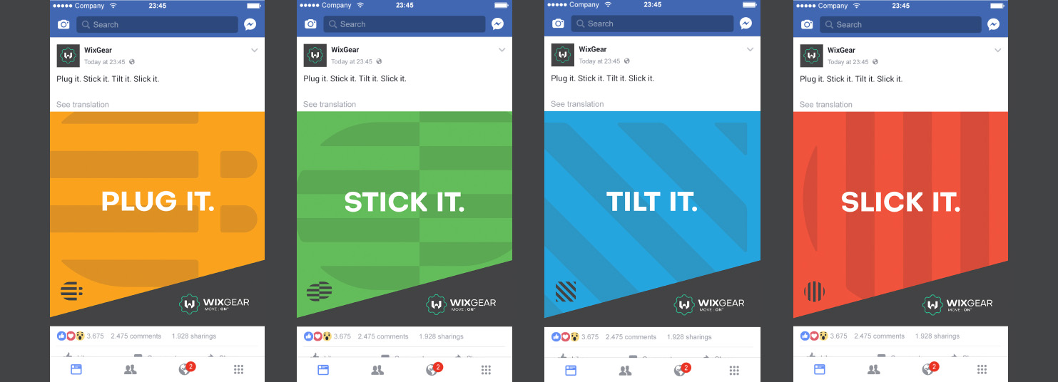
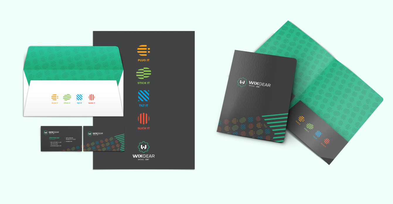
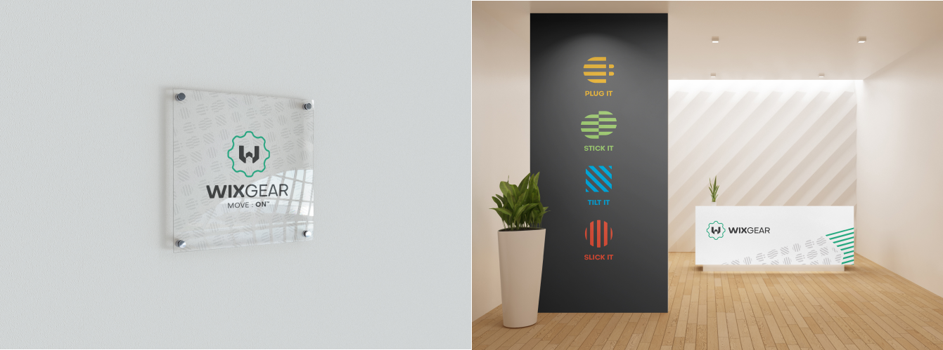
When we combined our focus elements (Four Points of Motion, Pattern and Arrow), we got the main focus element: The Trace of WixGear.

The idea of the trace was perfect to symbolize the motion: when the arrow passes by, it leaves an imaginary trace that contains the “Plug it. Stick it. Tilt it. Slick it.” symbols (the essential focus element) to represent what WixGear is all about.

The move is on!

img

Product Categories

THE ARROW ELEMENT

Every category has its own identity. Each category acts as an extension of an already established brand design, derived from all the elements we mentioned before.

Categories are related to their respective symbols: the “Four Points of Motion” symbols. Each category has its own unique color, icon, pattern and name.

img img img img

Layout Treatment

TILT IT UP A NOTCH

To further enhance the dynamic look of the brand, we tilted identity elements - like typography and graphic shapes - to a subtle 15 degrees. This was the final cherry on top that significantly added to brand recognition.

This is where we said “our job is done.”

img

Package Design

img img img img img

Promo Materials

img img img

Landing Page

img img

Social Media

img img

Print Ads

img img

Stationery Design

img img img img img

Office

img img img